In the design world, your website is often the first real interaction a client or buyer has with your brand. Yet even design-savvy businesses fall into avoidable traps that sabotage conversions and credibility. Whether you’re a designer, architect, decorator, or a product brand, here are the most common website mistakes we see – and how to fix them.
Avoid These Website Mistakes
Every designer and brand wants a site that looks amazing. But looks alone won’t book clients or sell products. Below are the common design mistakes that cost professionals credibility, leads, and revenue – plus what to do instead. If you spot any of these on your own site, now’s the time to clean them up.
Sideways Scroll – Don’t Do It
Horizontal scroll might look trendy, but it’s a usability nightmare. Clients won’t hunt for your content like it’s a hidden object game. Stick to intuitive, vertical layouts that work across devices and browsers. Creative doesn’t mean confusing.
Using Pinterest as Your Portfolio – Don’t Do It
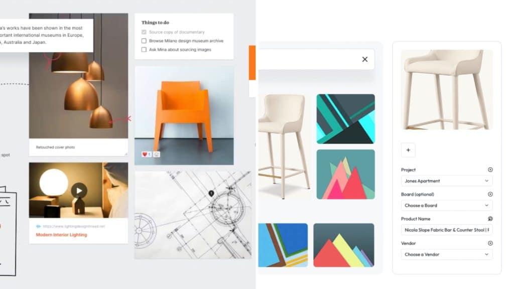
Pinterest is great for inspiration – but not as your main showcase. Sending clients off-platform means you lose control of their journey. Embed your best work directly on your site in curated, high-quality galleries with descriptions. Make your portfolio easy to access and hard to forget.
Hiding Pricing – Don’t Do It
Don’t make it hard to find your pricing. You don’t necessarily need to publish the exact prices for your work, but a range, starting at, or any other strategic way to showcase what your future clients can expect is a good idea. Whether you’re offering services or selling products, hiding your rates creates friction and doubt. Be clear or offer a pricing guide download in exchange for an email. Transparency builds trust.
Auto-Playing Media – Don’t Do It
Auto-play anything is a surefire way to send people clicking the back button. Music is especially intrusive, your site should feel like a premium showroom, not a pop-up ad. Let visuals and copy speak. Silence is luxury.
Vague Testimonials – Don’t Do It
Stock images and generic quotes like “she was great!” won’t cut it. Your testimonials should be specific, include real names (with permission), and ideally link to a completed project. That builds trust and proof.
Animating Every Image or Web Element – Don’t Do It
You know those websites where every element flies in from the left or right, with some kind of bounce, zoom, or other animation?
Animation can be beautiful when used sparingly. But when every image moves, it overwhelms the eye. Treat it like floral arrangements in a space: a few thoughtfully placed pieces elevate the design – too many make it chaotic.
Using Default Microcopy – Don’t Do It
Microcopy in forms and buttons is part of your brand voice. “Submit” isn’t compelling. Try “Book My Call” or “Start My Project.” These small tweaks guide your website visitors where you want to guide them.
Skipping Mobile Testing – Don’t Do It
Just because it looks great on desktop doesn’t mean it works on mobile. Test across devices before launch. Fonts, buttons, scrolling – it all needs to be seamless, or half your audience will bounce.
Treating Your Site Like a Brochure – Don’t Do It
Your site isn’t a digital flyer. It should guide, convert, and interact. Add elements that support engagement, like lookbooks, booking flows, or product quizzes. Make your website do more than sit pretty.
Not Updating The Year in The Footer – Don’t Do It
It’s a tiny detail, but it signals whether your brand is active or asleep. An outdated year in your footer – especially if it’s two or three years old – makes your entire site feel neglected. Update it yearly or automate it with a dynamic tag if you’re using WordPress. Small fix, big difference in perception.
Not Sharing Where Your Are Based, or Which Area You Service – Don’t Do It
Your dream clients might be searching for exactly what you offer, right in your area. But if your site doesn’t say where you’re located or which regions you serve, you’re invisible to them and to search engines. Don’t make people guess. If you’re location-based, list your city and service area clearly. And if you serve clients globally, say that too. Either way, name it.
Using Low-Quality Images – Don’t Do It
In the design industry, your visuals are everything. Blurry photos, pixelated logos, or stretched graphics instantly cheapen your brand. If your images don’t reflect your level of taste and quality, visitors won’t trust your expertise. Use high-resolution, properly sized images that align with your aesthetic. And always compress them for fast loading – beauty shouldn’t slow your site down.
There you go; my top pet peeves what comes to websites. Continue here to the complete website guide!