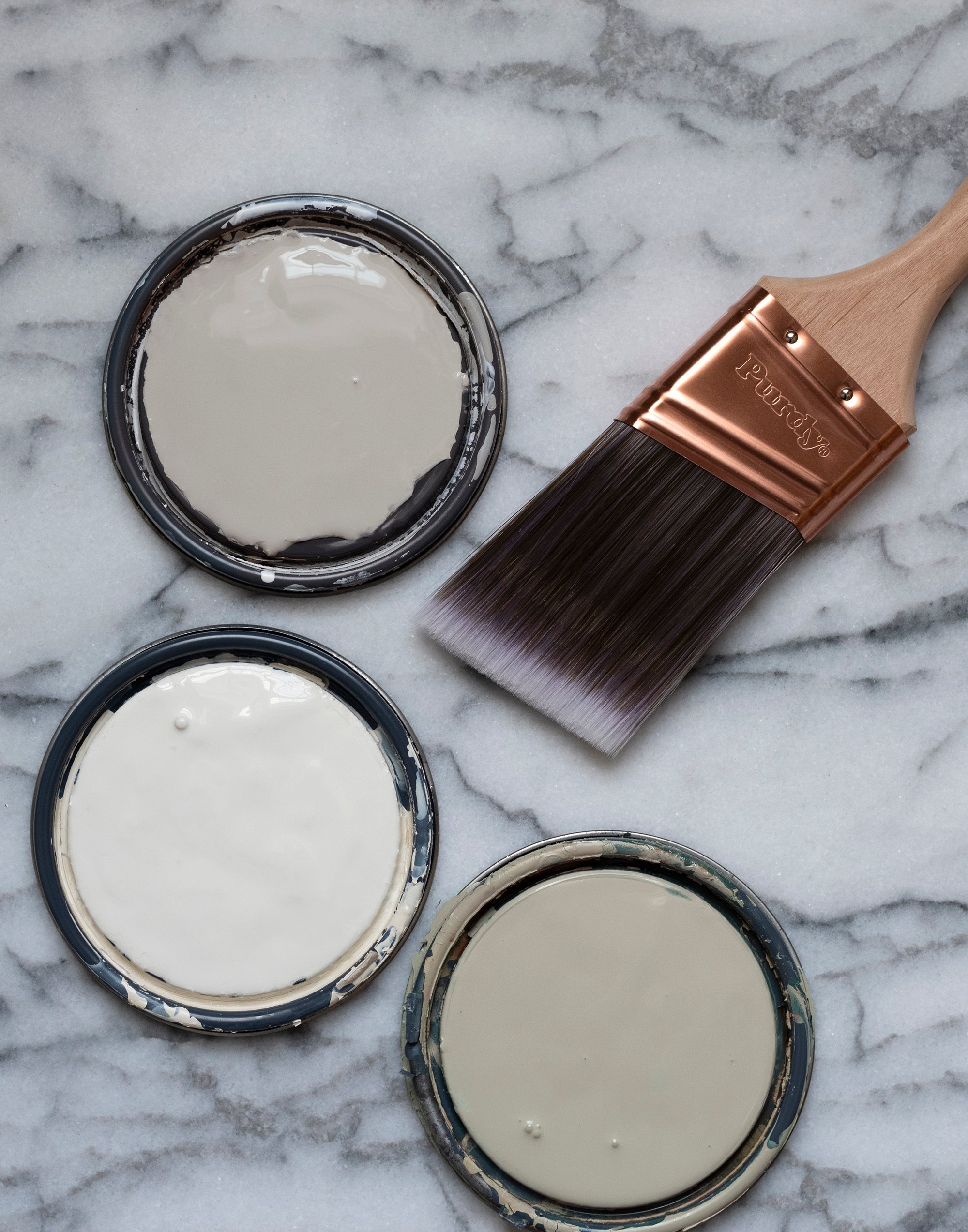
The beginning of a new year always brings planning, dreaming, and an updated list of home projects we’d like to tackle in the year ahead. Paint is always at the top of my list, as it’s an easy, affordable, and impactful way to refresh a room. If you’re also scheming this year or are searching for timeless swatches that feel warm, inviting, and will withstand the test of time… click through for 24 of my favorite neutral (non-white) paint colors! Don’t get me wrong- I love a fresh coat of bright white paint that eludes to a blank canvas, but adding a little pigmentation or saturation gives neutral hues longevity. These are perfect for the walls, millwork or trim, and even the ceiling. Find a preview of the soft welcoming hues I’ve been saving lately…
Before we dive into paint swatches, if you’re looking for some helpful tips for a professional paint finish- it begins with prepping your walls. Check out this post on how to get perfectly smooth walls: a skim coating tutorial. When planning our painted stripes in the entryway, it was important to achieve a super smooth, level five finish. While any textural wall can be painted, it will influence the finish you’re looking for. Find my swatch picks below!
Beige Tones

Beige doesn’t have to be boring. I enjoy this hue for many reasons… it’s warm, inviting, holds enough contrast against crisp white, and is one of those chameleon colors that effortlessly takes on the palette of its surroundings.

muslin / natural tan / neutral territory / accessible beige / clay beige / white sand
Beige is a historic neutral that (when done appropriately) will withstand the test of time. It also provides a great base for layering, allowing you to find really interesting decor and push design limits outside of the paint color. It’s a great match for any aesthetic!
Cream Swatches

Unlike a true, colorless crisp white… creamy hues add the perfect amount of depth, dimension, and warmth. This is optimal for millwork, highlighting finishes, and architectural elements. Sometimes you need the smallest amount of pigment to keep a space from looking cold or clinical.

alabaster / simply white / aesthetic white / seashell / cloud nine / origami white
Creamy and natural colors can also benefit rooms that are flooded with natural light, where a crisp white feels too bright or blinding. These swatches still feel like a classic white, without being too harsh.
Warm Gray & Taupe Hues

While cool gray has had its moment, warm gray feels classic and current. Taupe hues and warm neutrals can easily be layered for a buildable and curated aesthetic. Much like beige, it’s a chameleon hue that allows you to be creative with other finishes and materials thanks to its neutrality and ability to absorb its surrounding colors.

revere pewter / analytical gray / greige / agreeable gray / graceful gray / worldly gray
Unlike gray swatches that are likely to lean too cool, these are rooted with brown, red, or yellow undertones, giving them staying power. The majority of these hues also come from historic collections, which ensures they won’t be going out of style.
Buttercream & Golden Tones

The last neutral palette I’m really loving is buttercream and golden tones. If they’re feeling too yellow, remember- you can always cut them (like I did in the image above). Check out this post on how paint color percentages work and when to use them. These warm sunshine hues are also seen throughout many historic design collections, attesting to their longevity and classic aesthetic.

whole wheat / dorset cream / rich cream / shakespeare tan / butter cream / weston flax
In fact, there is a great example of Farrow & Ball’s Dorset Cream color in the home tour, Sycamore House by Josh Young, I recently shared. These timeless tones are perfect for adding warmth and the perfect amount of desaturated vibrance to any space- without feeling overwhelming.

FAQ
I previously used to work for a design firm, as well as taking in-person and e-design clients. However, because of time limitations- I’m currently not accepting client projects. Should that change, you’ll be the first to know!
I do think it’s important to note… you should ALWAYS swatch test paint colors. What appears one color in my home could look totally different in yours, as there are so many factors that determine color (natural light, overhead lighting, surrounding colors, decor, etc). If you’re looking to work with a designer, make sure to hire a local in-person professional for paint consultations! If you’re curious, I wrote a post on what it’s like to work with an interior designer.
Great question! If you’re not planning to paint your ceiling the same color as the walls or millwork- color drenching (as we now call it)… I recommend using Ceiling Bright White by Sherwin-Williams. It’s a cooler white specifically for ceilings and I’ve found it always looks good, no matter the room or lighting. I’ll drop an example from my home office for you below!

Related
Looking for more helpful posts on choosing the best paint color for your project, or pointers on application? I’ve shared plenty of helpful designer tips over the years! These are the most popular…
- How Paint Color Percentages Work and When To Use Them
- My Favorite Benjamin Moore Paint Swatches
- 10 Painting Tips for Cutting In
- Color Matching Our Kitchen Cabinets (my most requested paint color)
- Designer Trick : Choosing the Perfect Paint Color
- How to Paint a Door
- Timeless Paint Colors and Favorite Pairings
- 10 Pro Painting Tips
- Tips for a Durable, Professional Looking Spray Paint Finish
- My Top Paint Color Picks for Dark Kitchen Cabinets

I hope this post was helpful if you’re searching for classic swatches in the year ahead! Be sure to pin or save this post. These paint colors will withstand the test of time, giving you a blank canvas without going for a boring, crisp, or clinical white. As always, let me know if you have any questions in the comment section below! I’m happy to help.

The post 24 of My Favorite Neutral (Non-White) Paint Colors appeared first on Room For Tuesday.