Brown paint is an underutilized design tool: whether an accent color or a total commitment, the effect is mesmeric. “Browns are true gem colors” says architect Anais Blehaut. “Once you pass the rational brain block behind a brown, which is often associated with dark/dirty/sad, you can explore and enjoy.” Blehaut goes on: “Brown is chocolate and all the shades of treats associated. Brown is soil, earth, the cradle for life, and is synonymous to creation and regeneration.” Here are 10 favorite shades of brown paint from a host of architects and interior designers.
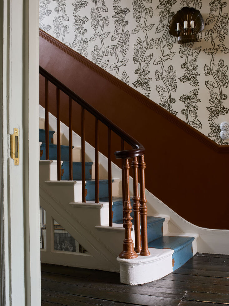
Above: At Beata Heuman’s own home, the stair rail and wall is painted in Cigar, a shade from Heuman’s own collaboration with Mylands. “Cigar is inspired by shaker pieces from the 1800s and the color of a good cigar. It is a surprisingly effective, and modern looking, graphic alternative to natural wood,” they explain. Photograph by Beth Davis for Beata Heuman LTD courtesy of Beata Heuman.
 Above: Architects Chelsie Lee and Emily Knudsen of Portland, Oregon-based Attend Interior chose Benjamin Moore Fort Sumner Tan 1119 for the kitchen cabinets of a remodel in Westmoreland. The color, Chelsie explains, “is a rich, caramelly, saddle leather color that doesn’t go too brown or too orange. It pairs well with the peachy-pink dining room and feels both bold and somewhat neutral.” Photograph by Malcom Lee for Attend Interior.
 Above: Architects Mathias Mentze and Alexander Ottenstein of Copenhagen-based firm Mentze Ottenstein implemented a deep ochre paint color, Oxydbrun Ground Color Paste from Linolie & Pigment in the bedroom and hallway of the Dinesen House in Denmark.
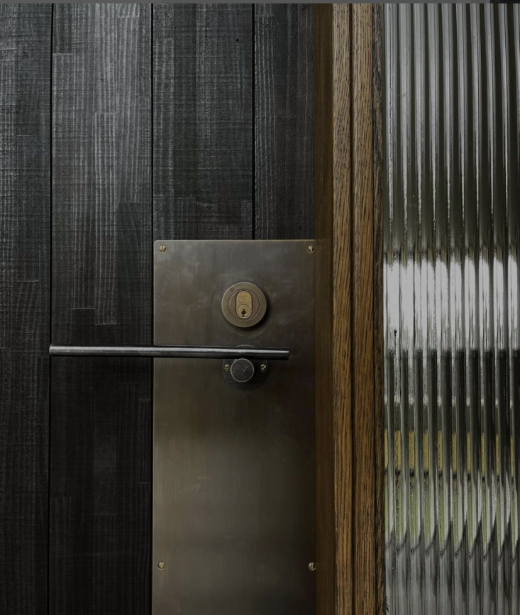
 Above: Architect Anais Blehaut of Daab Design in London applied Farrow & Ball London Clay No.244 to the kitchen wall and ceiling of a Paris kitchen. Says Anais: “Farrow & Ball London Clay is a perfect balance between depth, provided by absorption of light by the dark tone, and reflectivity, provided by the light tone. It changes radically with the surrounding luminosity and provides different ambiances. London Clay is also very warm and comforting but equally works with metal and cold colors which is great for a kitchen/dining room.”
 Above: In a 1640s Georgian house in East Sussex, Cassandra Ellis implemented a shade from her own line, Atelier Ellis, called Paper & String: “a deeply pleasurable brown.” Photograph from In the Stillness: A 1640s Georgian in an Affecting Palette by Cassandra Ellis.
 Above: Warsaw-based designer Marta Chrapka of Colombe Studio designed a writing/guest room with soft brown walls courtesy of Farrow & Ball Mouse’s Back No. 40. Photography from Creative Flow: A Novelist’s Elegant Pied-a-Terre by Colombe Studio.
 Above: Another example of Farrow & Ball Mouse’s Back No.40 from Marta Chrapka pared with a deep red shade on the built-in library shelving from another project. “When it comes to carpentry, I also like to use Mouse’s Back,” she explains “adding some contrasting color to the back, as in this library where Mouse’s Back is matched with red.”
 Above: New York City-based designer Sebastian Zuchowicki designed a guest room at The James Bradley on the Jersey Shore with a Bauwerk Colour limewash paint called Tobacco. Photograph from Fresh Directions: 9 Ideas to Steal from The James Bradley, a Moody Hotel in an Unlikely Locale.
 Above: Architecture for London opted for a dark brown shade on the walls and radiator of a guest bedroom in a London refurbishment. The shade, Broccoli Brown No. 198, is from Farrow & Ball. For more see our post A Historic Haven in London Refurbished for a Curator and Art Historian.
 Above: Color expert, designer Nicola Harding isn’t averse to using rich shades of brown paint in interiors. Here, Farrow & Ball Tanner’s Brown No. 255 coats the walls of a small bar space connecting a dining room to library in an 18th century house designed by Harding. For more see our post Living with Color on the Edge of London: 8 Tips from Paint Wizard Nicola Harding.
For more tried-and-tested paint colors, see our posts:
- 10 Easy Pieces: Architects’ Yellow Paint Picks
- 10 Easy Pieces: Architects’ Red Paint Picks
- 10 Easy Pieces: Architects’ White Paint Picks
- 10 Paint Colors with Cult Followings: Architects’ All-Time Favorite Paint Picks
- 10 Easy Pieces: Architects’ Favorite Blue Paints for Anywhere in the House
- Architects’ 12 Favorite Blush Pink Paints
- Remodeling 101: 10 Architects’ Moody Paint Picks
- Architects’ 8 Favorite Warm Gray Paints