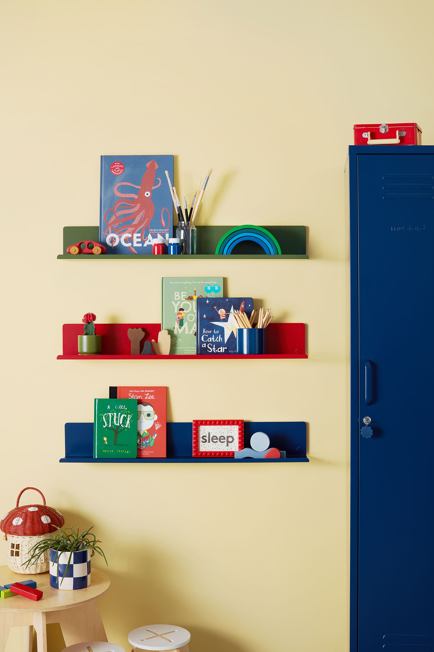
Perhaps it’s the emergence of butter yellow over the past few months, but all I can think about is how to incorporate more color into my space. My husband and I have always been drawn to a calming, coastal palette of blues, greens, and grays. Then, I came across Jessica Sowerby’s recent collaboration with Mustard Made, featuring a yellow striped wallpaper perfectly complemented by the brand’s Lowdown Locker.
Sowerby wrote the book on colorful designing—literally. The color consultant behind @thehousethatcolourbuilt published Colour Confidence: A Practical Handbook to Embracing Colour in Your Home in 2023, and her advice is brought to life in her vibrant, creative, and color-saturated home that’s as eclectic as it is curated.
“I genuinely think you can use color everywhere!” Sowerby says. “I always advise my clients to view their whole house or space as one, so create a color scheme that flows throughout.”
Below, Sowerby and several interior designers to determine the best color palette and placements for any room in your home.
1. Pull Personal Items for Your Color Palette
If you’re intimidated by the idea of conceptualizing a color palette, a few personal items can serve as the initial inspiration for your creative process.
“When adding color, I tend to start with a particular item, be that a piece of furniture or a little decorative item that I really love, and use that as a starting point for the room’s palette,” Sowerby says. “My personal favorite way is to combine complementary or opposite colors, like blue and yellow, as it brings the best out in both colors!”
Mustard Made
2. Think About Your Home’s ‘Mood’
Another route could be discussing how you want your home to feel. From light and bright to dark and moody, you can create virtually any atmosphere with color.
“A strong color story isn’t just about picking pretty shades; it’s about creating flow, mood, and cohesion from room to room,” explains Vyanca Soto of Market Studio Interiors. “It’s what makes a home feel intentional rather than accidental. Even if every room has its own personality, a well-chosen, overall palette can tie everything together in a seamless and elevated way.
That said, color is also personal, which is why you need to prioritize the colors you love versus what’s trending.
“Color is really subjective; what brings joy to some people will overstimulate or underwhelm others,” Sowerby adds. “And have fun with it! If you love it, that’s all that matters.”
3. When in Doubt, Turn to Classic Combos
Sowerby recommends selecting three or four colors to create a sense of harmony throughout your home. To give you a few thought-starters, these are trusty pairs our experts love:
- Older classic homes: Rich hues like dark greens and blues
- Coastal homes: Soft blues, seafoam greens, chalky whites, and sandy beiges
- Spanish or Mediterranean-style homes: Earth tones like terracotta, olive, ochre, and deep brown
- Modern homes: Charcoal, taupe, and warm metals

Design by Susie Novak, Photo by R. Brad Knipstein
4. Choose More Unexpected Areas for New Hues
Don’t ignore some designers’ go-to spots for color, including cabinets, walls, and even the ceiling (As Novak says, “We spend a lot of time looking up!”). Christine Markatos Lowe of Christine Markatos Design is a major proponent of colorful wallpaper.
“We love to wallpaper any and every surface—ceilings and backs of bookcases included,” she says. “This can be a way to introduce color in a big way or just as an accent.”

Design by Christine Markatos Lowe; Photo by Manolo Langis
5. Start Small with Pops of Color
Before taking the plunge, try just a few pops here and there. Soto’s favorite approach is through layered elements such as art, textiles, ceramics, and florals.
“Start with a neutral foundation and build in color similar to how you’d accessorize an outfit,” she says. “Pillows, throws, books, and accent chairs are all great low-commitment ways to experiment with color.”
As you apply these tips, Soto reminds us that there isn’t really a “wrong” way to introduce more color in your home.
“At the end of the day, color should feel like a reflection of you,” she says. “It’s not about following a rulebook; it’s about choosing tones that make you feel something every time you walk through your home.”