What do you do when your new home doesn’t necessarily warrant major renovations, but doesn’t really match your style? This was what interior designer Alexandra Azat of Plaster and Patina was facing with her 1920s Altadena, California, home.
Michael P.H. Clifford
While the house’s design wasn’t exactly her aesthetic, it was still a special space for Alexandra. “I first saw the home months prior when my husband parked by it and told me the house reminded him of me,” she explains. “Six months later, I received a call from my realtor asking if I was interested in an off-market property. It turned out to be the home my husband had pointed out. The house almost picked me in a sense, and it was in perfect timing. I needed to choose to move and also choose to have a double mastectomy right before we moved in. The home became a space for healing and gratitude for me.“

Michael P.H. Clifford
So after move-in, Alexandra got to work with making the space her own, showcasing her contemporary and eclectic style. The kitchen, in particular, had undergone a big remodel seven years prior. “It wasn’t at all what I would have done, but it was ‘good enough’ to give it a facelift (the name we give to a project that doesn’t require moving walls or structural elements) and plan for a larger renovation after a few years,” Alexandra explains.

Michael P.H. Clifford
She and her team didn’t change the layout of the kitchen, instead they added new design details. “In the kitchen, we reworked the hood by removing the top cabinets and extending it outward from an insert to a plaster hood,” Alexandra says. “We added decorative beams and wallpaper to the ceiling, and we beefed up the hanging pot rack chandelier, adding an unlacquered, larger piece around the original and going all in on the copper details. We redid the oven backsplash to feature classic Pratt + Larson tiles in varying creams. We re-honed the countertops and re-faced all of the cabinetry to be inset with a textured linen wallpaper inlay in certain areas to soften the space.”
The kitchen “facelift” was just a start for Alexandra, as she infused her own style throughout the home, adding new light fixtures and wallpapering many of the rooms.

Michael P.H. Clifford
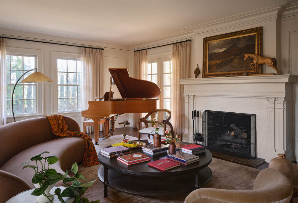
Her design inspiration was the home itself. The space’s architectural style and its layout reminded her of her East Coast and Long Island roots. Alexandra’s priority, like with any of her design projects, was making the house feel cozy and inviting.

Michael P.H. Clifford
“I want my spaces to envelope those who walk in and make them feel safe and grounded,” she says. “We do this through the use of grounded colors along with authentic finishes and textures, layering them in a way that makes a space feel thoughtful and interesting—we want our space to inspire.”

Michael P.H. Clifford
The entry was an important space to both preserve and update. When Alexandra was touring the home, the first thing she saw was the entry’s beautiful mosaic and she immediately fell in love with the space.
“The beauty of the home stemmed from its welcoming atmosphere immediately upon stepping into the entryway,” Alexandra explains. “From the beautiful, original entry porch to the glorious and generous entry vestibule, it was really designed for enjoyment. The entry vestibule boasted huge French doors, and we softened it with soft, sheer drapery.”

Michael P.H. Clifford
Instead of covering up the mosaic, they added a runner for a welcoming feel. The can lights were removed and replaced with unlacquered brass flush mounts. A Roman clay treatment was added to the ceiling, and inside, everything was repainted and the original woodwork was left.

Michael P.H. Clifford
In the dining room, there’s new paint, wallpaper, lighting, and gallery walls. The geometric pattern of the drapery “packs a punch” and modernizes the space. The original parquet floor remains.

Michael P.H. Clifford
Another highlight of the home is the bar, which is one of Alexandra’s favorite rooms. “We saturated the room in the paint color Mahogany by Farrow & Ball and made it a space to relax and unwind. Despite being a space to entertain, we began enjoying our morning coffee in the bar,” she adds.

Michael P.H. Clifford
And lastly, Alexandra says she went “truly wild” in the kids’ room, with a fun mural, vintage Jenny Lind beds, a rattan chest, and a mix of green hues.

Michael P.H. Clifford
Alexandra loved the whole design process. While designing for herself used to be difficult, it’s now therapeutic for her—the key is deciding from the beginning what her inspiration is to avoid distraction.
“There are a few things that always keep me on track when designing for myself,” she explains. “I keep a classic and timeless overall feel as my north star, and I know that I am always and forever drawn to a rich, neutral palette. I love spaces that ‘pull you in,’ meaning an iteration of a similar color scheme that runs through rooms to pull me through the home and draw me into each space. Each room has its own personality, yet is cohesive.”