Move over, boring and sterile; we’re going to be bathing our homes in rich, warm colors in 2025—at least, that’s what the paint companies are saying. Every year, certain paint companies announce their Colors of the Year, much like Pantone announces its Color of the Year. And the 2025 lineup contains warm and deep browns, cozy reds, rich purples, and uplifting blues.
Much like Pantone’s Mocha Mousse, the highlighted hues have depth and nuance, and many of them aren’t strictly one color. For example, Benjamin Moore’s Cinnamon Slate is a mix between plum and brown. Those kinds of layered, multi-dimensional hues might also influence our other interior design choices—we may see these hues incorporated into accessories like pillows, rugs, and accent chairs. In short, it’s time to think a little bolder with color in 2025.
Take a look at the 2025 Color of the Year predictions below.
Rumors MQ1-15 by Behr
Behr is predicting bold statements in 2025, which is why the company chose ruby red Rumors as its color of the year. When doing research, they found that three quarters of Americans said they would consider painting a room or wall a shade of red.
“We’re seeing people embrace color like never before,” said Erika Woelfel, Vice President of Color and Creative Services at Behr Paint Company, in a press release. “Rumors is a modern take on the timeless red that creates an energetic appeal to make a lasting statement in a stunning way.”

Cinnamon Slate 2113-40 by Benjamin Moore
Described as a mix between weathered plum and velvety brown, Benjamin Moore’s 2025 Color of the Year, Cinnamon Slate, is both versatile and eye-catching.
“As the use of more saturated color in design has increased in recent years, we are seeing a growing interest in more nuanced colors, whose undertones add intricacy and dimension,” said Andrea Magno, director, color marketing & design at Benjamin Moore in a press release. “Cinnamon Slate is an inviting hue that offers enduring style and modern sensibility. Its depth and richness bring an air of approachability and sense of comfort throughout the home, making it a new favorite for years to come.”
Raku by C2 Paints
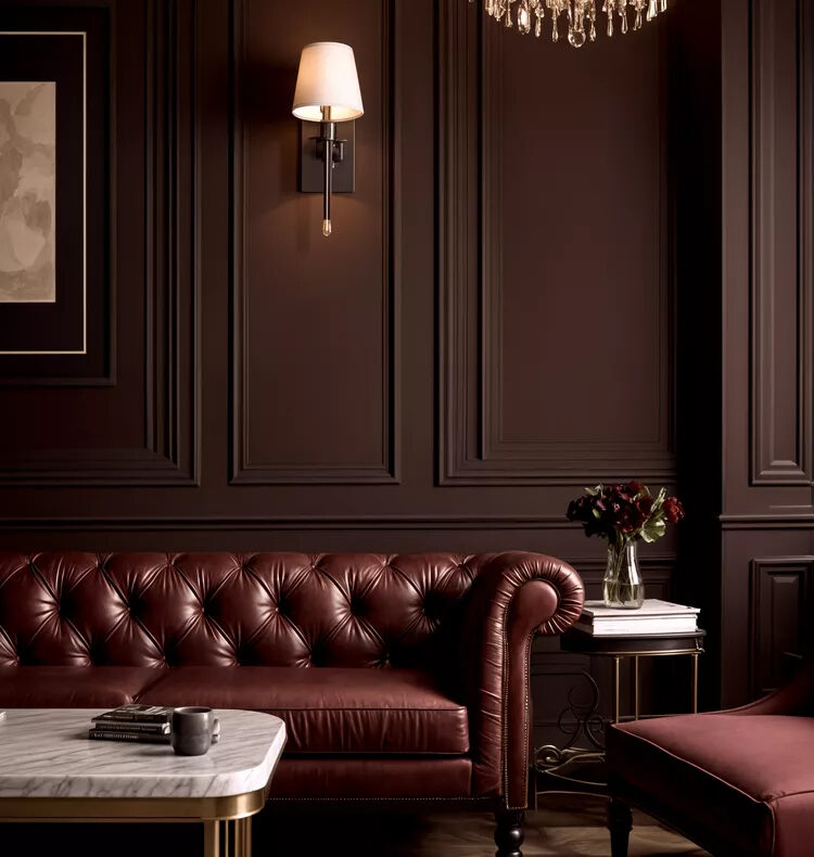
C2 Paints’ Raku is inspired by the earthenware used in Japanese tea ceremonies. The brand describes the hue as an “earthy, burnt, brownish red with oxidized undertones that infuse spaces with drama and intimacy.”

Caramelized DET687 by Dunn-Edwards
Dunn-Edwards predicts that in 2025, earthy, timeless colors will be in the spotlight, so that’s why it chose Caramelized, a warm terracotta brown as its pick.
“In the current fast-paced, high-tech age, we find ourselves drawn to more saturated and timeless colors to create personal spaces that feel welcoming, stylish, and grounded,” said Lauren Hoferkamp, Lead Color Expert at Dunn-Edwards in a press release. “When considering the draw to a mindset of ‘old is new,’ Caramelized emerged from our 2025 Color and Design Trends as a clear representation of this new year—the effortlessly versatile hue pairs well with various styles, from vintage-inspired interiors to contemporary spaces.”

Mapped Blue 429-5DB by Dutch Boy Paints
A medium tone blue with subtle yellow undertones, Mapped Blue is Dutch Boy Paints’ pick for its 2025 One-Coat Color of the Year.
“Our 2025 Color of the Year, Mapped Blue, is more than just a trend: it’s a reflection of changing consumer values,” stated Lisbeth Parada, Color Marketing Manager for Dutch Boy Paints, in a press release. “We’re seeing a significant shift, particularly among Millennials and Gen Zs, toward products that offer durability, functionality, and timeless aesthetics. Mapped Blue answers this call, providing a classic yet modern charm that can adapt to various design styles and stand the test of time.”

Purple Basil PPG1046-7 by Glidden Paint by PPG
Glidden Paint by PPG chose the warm and bold Purple Basil. “So many people start their color selection journey looking at bold hues, but ultimately settle for a more expected or muted color,” said Ashley McCollum, PPG color expert, Glidden brand, in a press release. “This year we are encouraging these ‘color chip daydreamers,’ as we call them, to put aside trepidation about what the neighbors will think or potential resale value. For 2025, purple isn’t just permitted, it is encouraged.”

Elderton by Graham & Brown
Elderton, Graham & Brown’s 2025 pick, takes its name from the Elder tree, which has deep brown leaves. It’s described as a “timeless and charming shade [that] is a perfect neutral toned brown which will never go out of fashion.”
Quietude HGSW6212 by HGTV Home by Sherwin-Williams
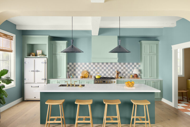
HGTV Home by Sherwin-Williams normally chooses a color palette of the year, with its color of the year included. For 2025, the paint company’s palette is “Natural Refined,” which contains soft colors with a little bit of contrast. And Quietude, one of the hues, is the 2025 Color of the Year.
“The ‘Naturally Refined’ Color Collection embraces the desire for simplicity and slower living,” said Ashley Banbury, color marketing manager at HGTV Home by Sherwin-Williams, in a press release. “Thoughtfully curated with longevity in mind, each shade emanates elements of timeless design and quiet luxury to help support a living space that feels meaningful. Within the collection, the softened sage green Quietude stands out as the 2025 Color of the Year and sets the stage for a quiet space to promote relaxation.”
Color Capsule by Sherwin-Williams
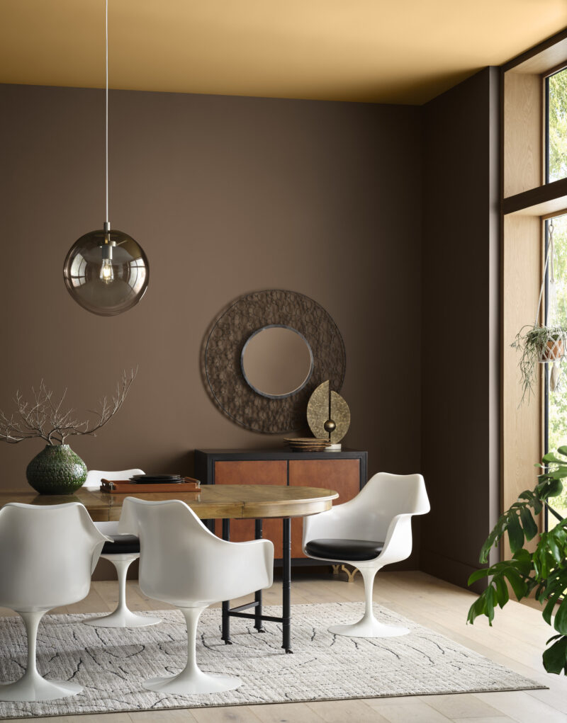
Instead of choosing one color this year, Sherwin-Williams chose a capsule of hues to commemorate its 15th Color of the Year anniversary. The colors are Grounded SW 6089, a versatile brown; Sunbleached SW 9585, a neutral hue that’s deeper than white, and not quite gray; Chartreuse SW 0073, a vibrant yellow-green; Rain Cloud SW 9639, a deep gray-blue; Clove SW 9605, a brown that’s almost black; Malabar SW 9110, a sandy beige; Bosc Pear SW 6390, a “cinnamon-dusted golden hue;” White Snow SW 9541, a bright, pure white; and Mauve Finery SW 6282, a true mauve.
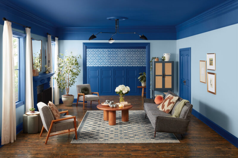
Encore 8002-45G by Valspar
Rich blue Encore is Valspar’s 2025 pick. “Encore is a color for any space or application. Its atmospheric deep blue tones emulate both the elusive luxury of Old World design and the futuristic blending of our physical and digital world, making it a color that feels familiar and unexpected at the same time,” said Sue Kim, director of color marketing at Valspar, in a press release. “This makes it an ideal backdrop to ground a room, leaving space for spirited pops of complementary colors. Encore’s versatility means it also can shine on its own through playful applications inside and out, such as on wood, decks, or concrete pavers.”

