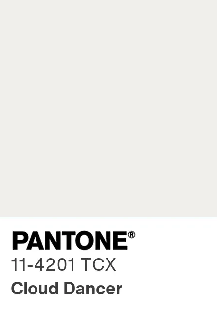
Pantone’s choice for 2026 – Cloud Dancer, a soft, natural white – has landed with a mix of curiosity, approval, and skepticism across the design world.
On one side, publications like Vogue and Adweek highlight the strategic neutrality of the shade. They frame Cloud Dancer as a “reset,” a response to an oversaturated visual culture and a practical foundation for brands seeking calm, clarity, and broad appeal. Like always, several early adopters in home, fashion, and consumer goods are already integrating the color into 2026 lookbooks, product lines, and packaging systems.
On the other side, outlets such as The Guardian point out that the choice is unusually restrained for a Color of the Year. Some are questioning whether selecting a white – particularly one marketed as symbolic of purity and simplicity – risks reading as safe, sanitized, or out of touch with a time that is anything but uncomplicated.
People making fun of Pantone by offering alternatives has been filling my threads overnight.
My own view aligns more with the latter: Cloud Dancer doesn’t reflect where design is going… more like where design has already been.
Where the Market Has Already Shifted
The softness narrative – bouclé, rounded silhouettes, quiet minimalism, “purity” palettes – has been tapering for several seasons. Designers have progressively stepped away from the cocooning aesthetic that defined the early 2020s.

As we’re heading towards the new year and major trade shows here in Europe, I’m reading a disconnection, like…
Maison & Objet in January 2026
Recent editions highlight:
- Greater material experimentation
- Strong primary colors resurfacing
- A shift toward pieces with presence and identity, not neutrality
- Homes designed to adapt, not retreat
This is not the environment in which a symbolic soft white feels forward-looking. What do you think?
Salone del Mobile / Milan Design Week
The direction is even clearer:
- Earth-driven palettes: moss, clay, ochre, terracotta
- Material contrast: matte vs. gloss, lacquer vs. wood, glass as a feature material
- Sculptural forms and functional-art objects replacing soft silhouettes
- A move toward interiors that express character, not erase it
In this context, Cloud Dancer feels like a quiet breather between trends rather than a true indicator of where design is headed.
The only thing everyone agrees on: The conversation around Color of the Year isn’t about color at all.