Since we’re here at the near end of 2025 (and with it being the holiday season), we thought one more post helping a few of our beloved readers and followers (you all:)) with your real life design problems was the least we could do. We truly appreciate you all more than we could ever say, and if you could help each and every one of you, we would! Unfortunately, we don’t have the bandwidth for that, so hopefully these 4 examples will inspire you and give you the energy you’ve been looking for to get that project you’ve been putting off finally done. I think we’d all like to start 2026 in a better place if we can, right? So let’s just get right to it, shall we?
Wallpaper Combo Drama
Here’s what our first reader/follower is asking for help with:
“I want to do a fun but timeless wallpaper in my living room (and small entryway) that “go” together, but there are 1 million options, and I can’t decide. I have about 60 samples rn. I also have mostly looked for peel-and-stick options that I can do myself, and also because I like to change things up. Anyway- here are a few pics…and I obviously didn’t clean up before I took them. Oh- and my style/aesthetic is a mixed bag. Modern/ a little traditional/ cottage? Idk .”
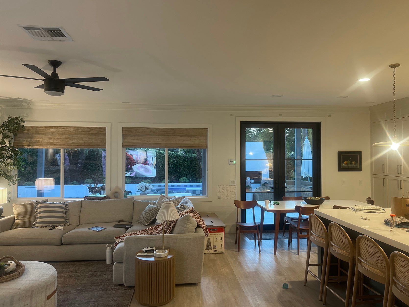
First off, we can all agree that this is a beautiful home! But we have wallpaper combos to suggest. So there are a few things that struck me right off the bat.
- This home has a very clear neutral color palette, so that’s what I’m going to lean into.
- Since it’s so neutral, going fairly bold color-wise will likely feel way too visually overwhelming.
Next, here are the rules I was using/she can use if what I put together doesn’t speak to her:
- Mix different pattern scales – large with medium, large with small, medium with small (that way they don’t visually compete).
- Go bolder either with color or pattern in the entry since it’s a small and more contained space (plus it’s fun as the first impression when you walk in!)
- Not a rule, but I like to mix an organic pattern with a more geometric pattern (as you will clearly see lol). It makes the two spaces feel dynamic and different (but also two organic patterns or two geometric ones can also be awesome. It all just depends on the actual designs).
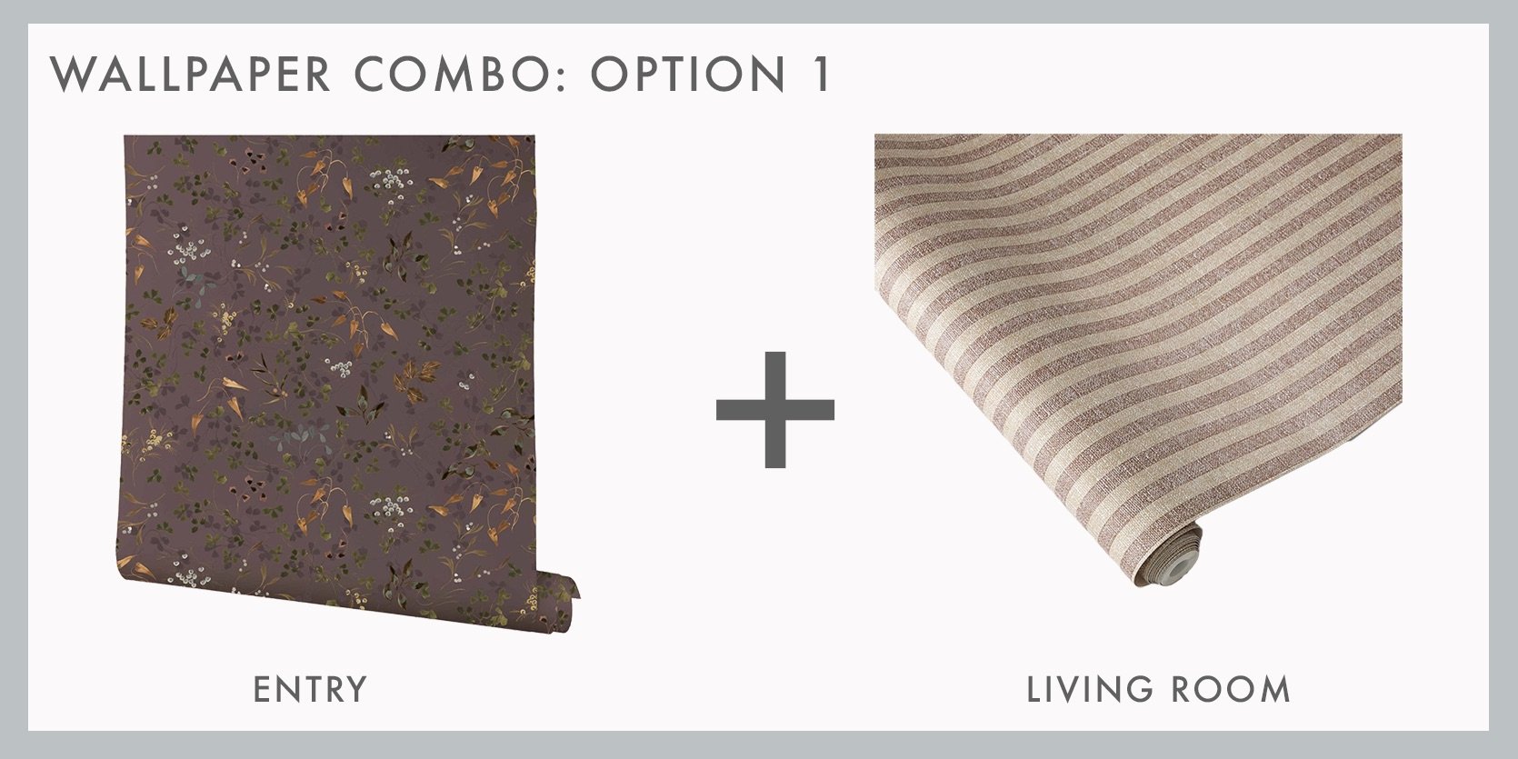
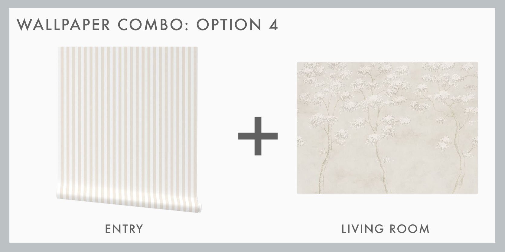
Verte in Mink | Charles Street Stripe
I took a risk and went with this amazing mink-colored floral wallpaper for the entry. It’s rich but not so much that I think you’d get sick of it fast. I also love the hits of blue and amber in it! Also, it’s a Kelly Ventura design (which we used one of her papers in Kaitlin’s bedroom), so we can attest to the quality. The striped paper is by Jeremiah Brent (whose taste is unmatched). It was also a Domino Good Design Award winner this year! We love a neutral stripe, but this one is a little deeper in tone (which holds up to the entry wallpaper) and is textured, which adds so much warmth.
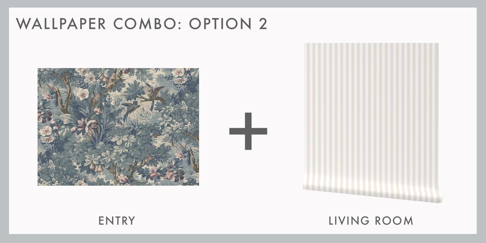
Lush Grove in Light Blue | Cream Stripes
Another risk, haha! As you are all likely very aware, blue is a neutral to us, and the variations of blue tones in this paper are so soft but lush (hence the name). Another bolder option for the entry, which I then paired with a much softer, creamy stripe for the living room. Emily used a soft stripe for her stairs at the farmhouse, and it’s the perfect amount of interest without taking over.
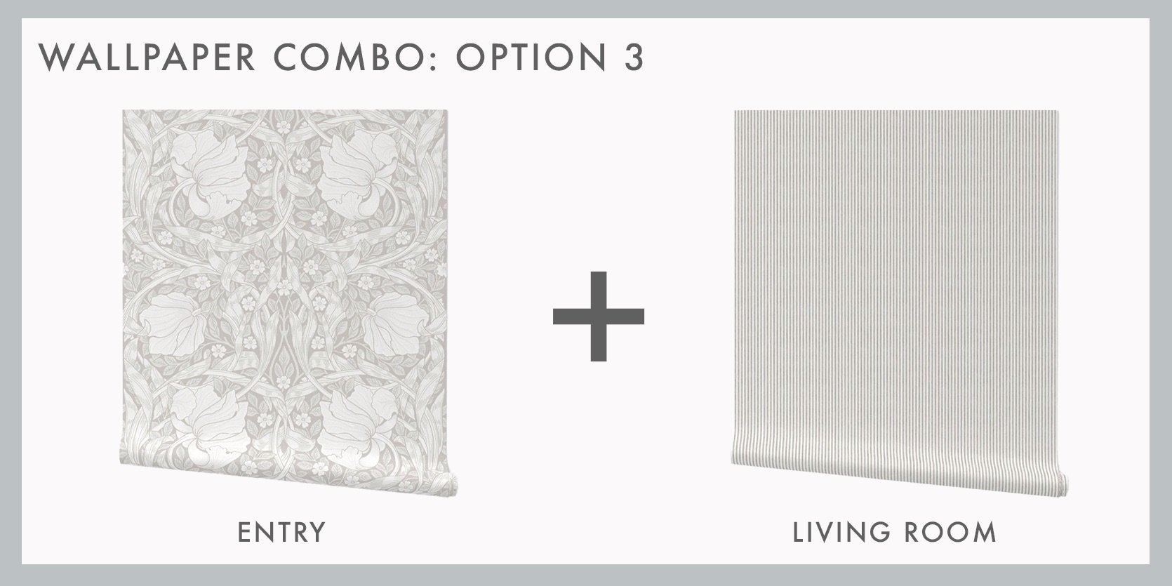
Pimpernel in Vintage White | French Stripes in Antique White
Now, for the actual neutrals, since that’s what it looks like she’s going for, given the samples in her entry. The first two examples also had mixed scale patterns, but this one is very clear. I again like the “bolder pattern” for the entry. This floral is so elegant and whimsical. Then, for a very small-scale stripe (sorry, I know they each have stripes), I love this one. If any of you are worried that stripes might be a lot, remember that large (especially large-scale) is important to add to any wallpapered wall to break up the pattern visually. I do think that these could easily be swapped in terms of location, too!
Cream Stripes | Wilhelm in Gray
Lastly, I really love this creamy stripe, so I used it one more time because it looked so good with this stunning mural. Speaking of Jeremiah (and husband Nate Berkus), many of their projects and personal homes have murals like this…but hand-painted. That’s something to aspire to, but for now, this peel-and-stick mural is so so beautiful, and I think it would look AMAZING in this follower’s living/dining room.
Hope this was helpful! Onto the next…
Vintage Kitchen Refresh
It’s a tricky place to be in when you want to make a room, like a kitchen, better, but also have plans to renovate sooner rather than later. That’s the dilemma here. Let’s see what they are looking for help with…
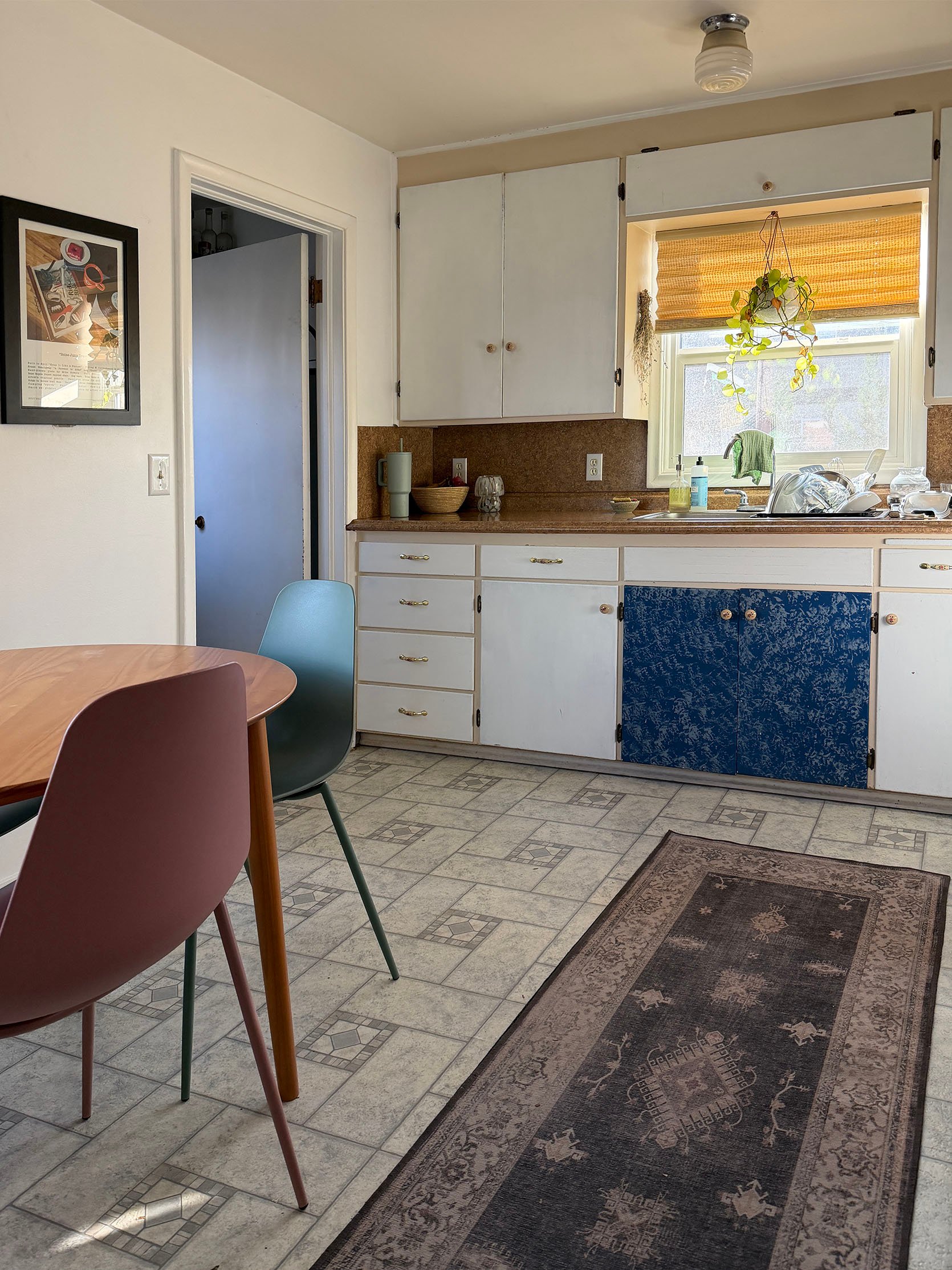
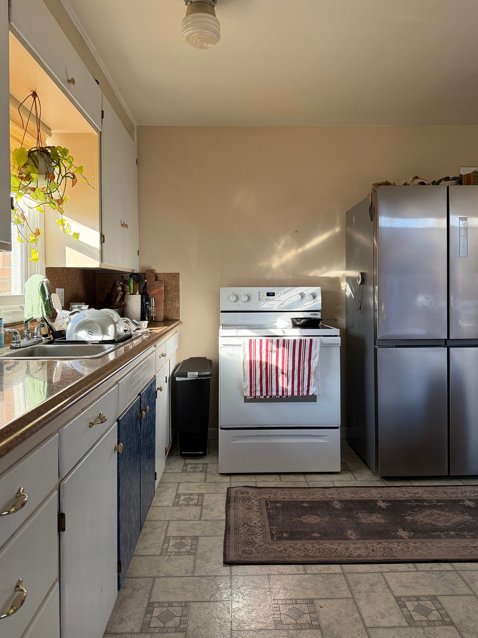
“We have a small 50s kitchen that I think was last renovated in the 70s. We bought the house 7 years ago and have just never known what to do with the kitchen. We are now at a place where there is a good chance we are going to add on to the house and in that case we would add on a new, larger kitchen. Because of this, we have decided we just want something temporary that will hold us over until we do a big addition or renovation.
Attached are some images of my space. We just put in some peel-and-stick floor tiles, so I have attached photos from before the peel-and-stick and after as well. My style is kind of all over the place. I like mid-century but also Scandinavian and basically everything in between. I think two prime examples of my style are the River House that Emily designed, as well as Kaitlin’s living room. Those spaces are pretty spot on with the style I gravitate towards and similar to what the rest of my house looks like.
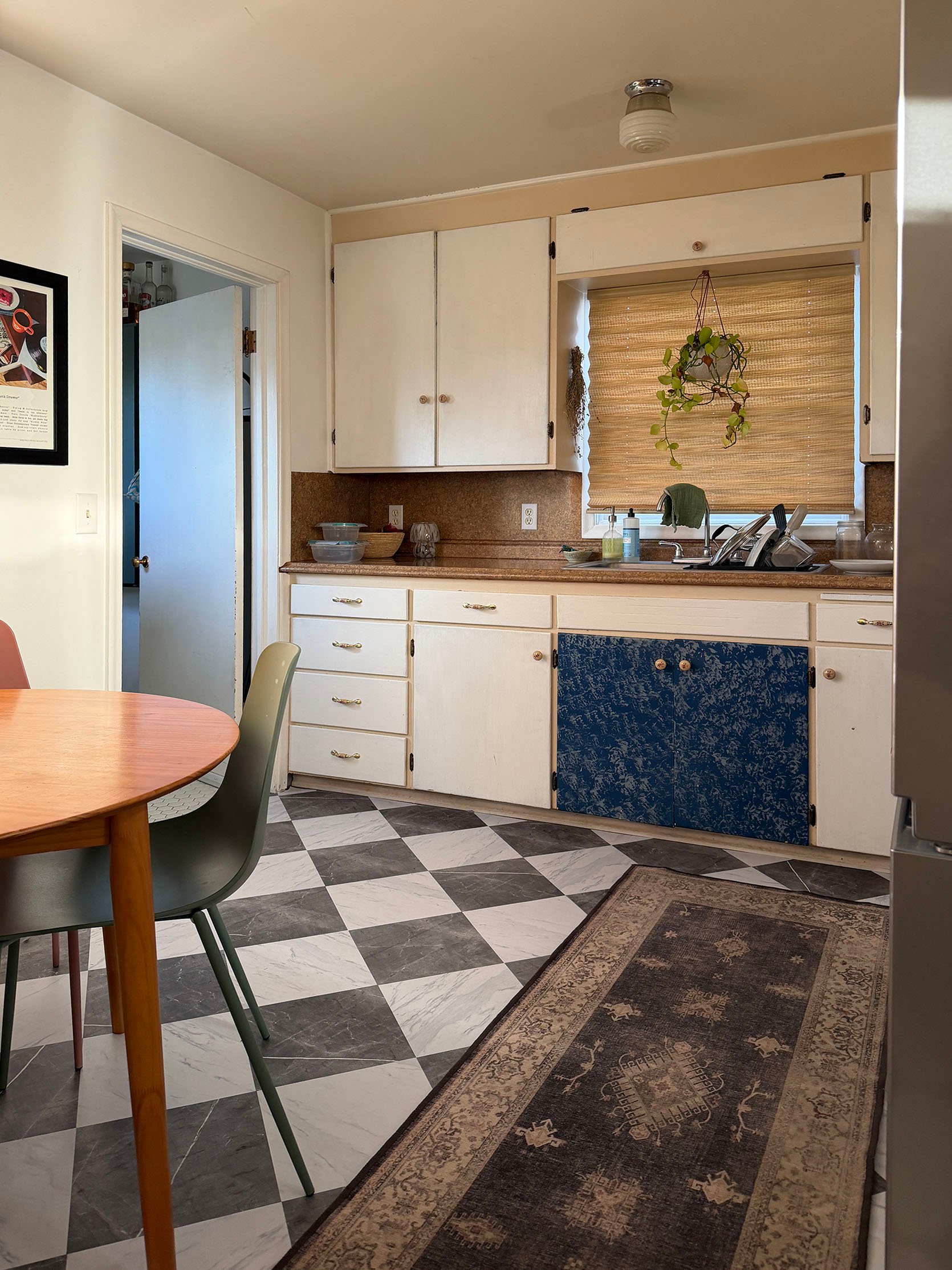
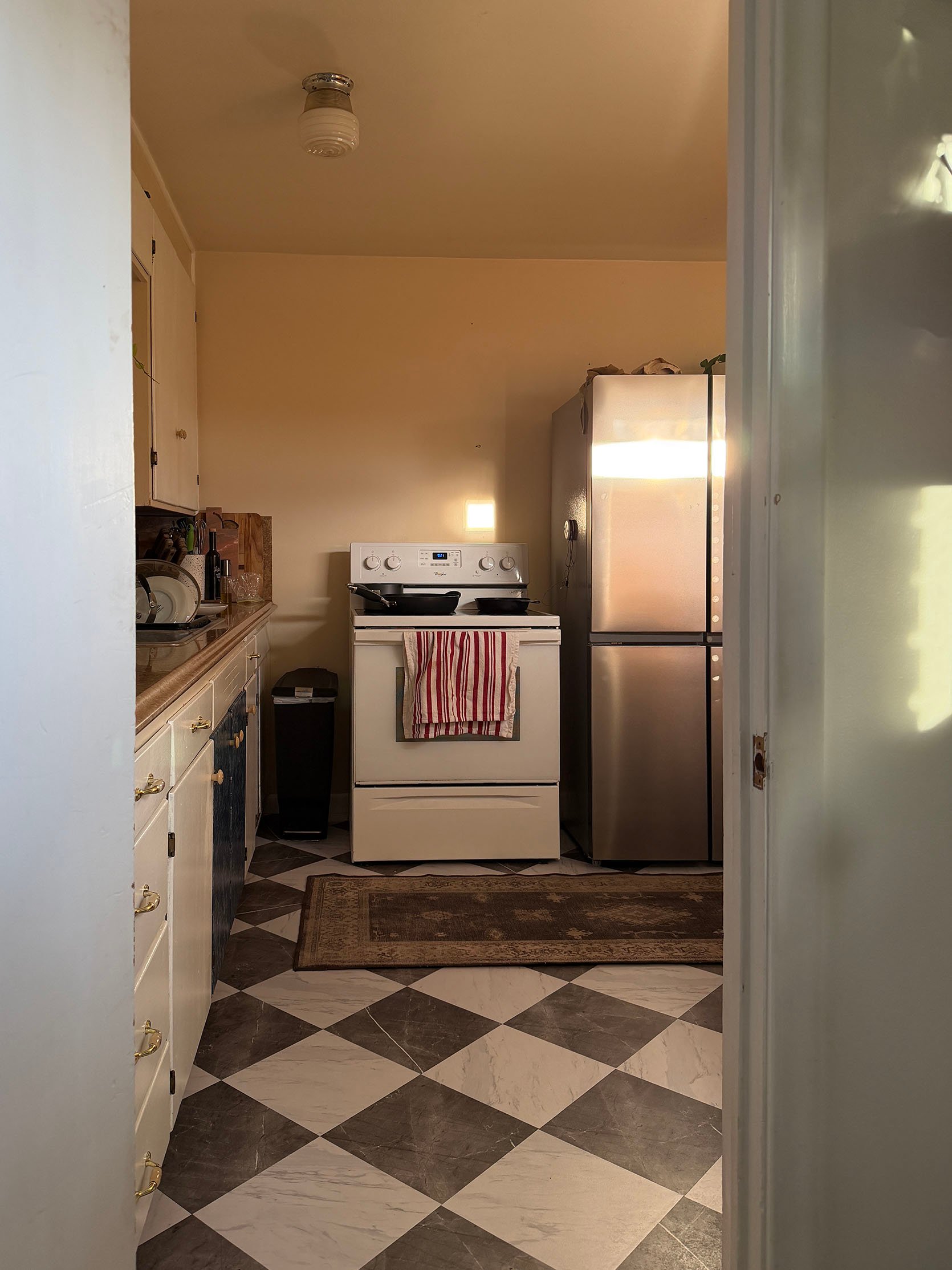
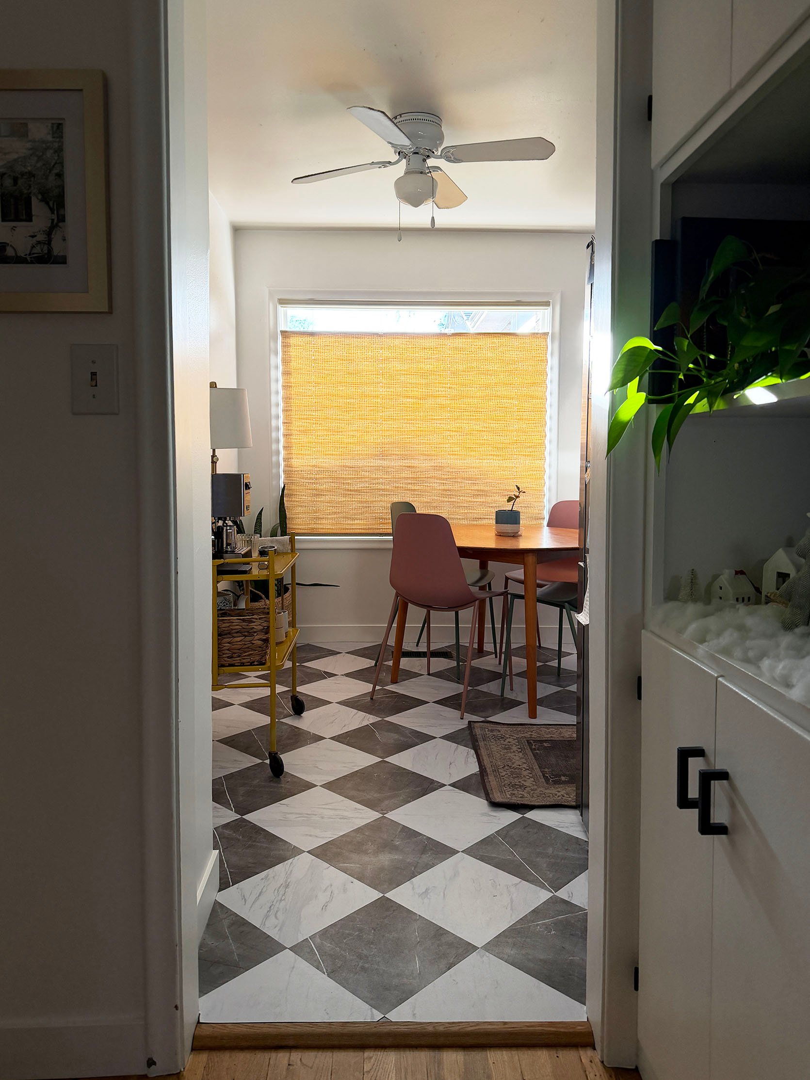
As far as budget, because this is a temporary fix, we are trying to keep it REALLY low. We are open to doing peel-and-stick tiles and stuff just to keep it low. We really want to keep it under $1500 for everything. We already spent a little under $200 on the peel-and-stick floors.”
Ok, those inspo project references are so helpful! Let’s get to work! I really love those new floor tiles, so that’s a great first step. The main culprit, and what will make the biggest difference, is painting the cabinet and changing the hardware. But let’s jump right into my first mood board so you can follow my thought process more easily.
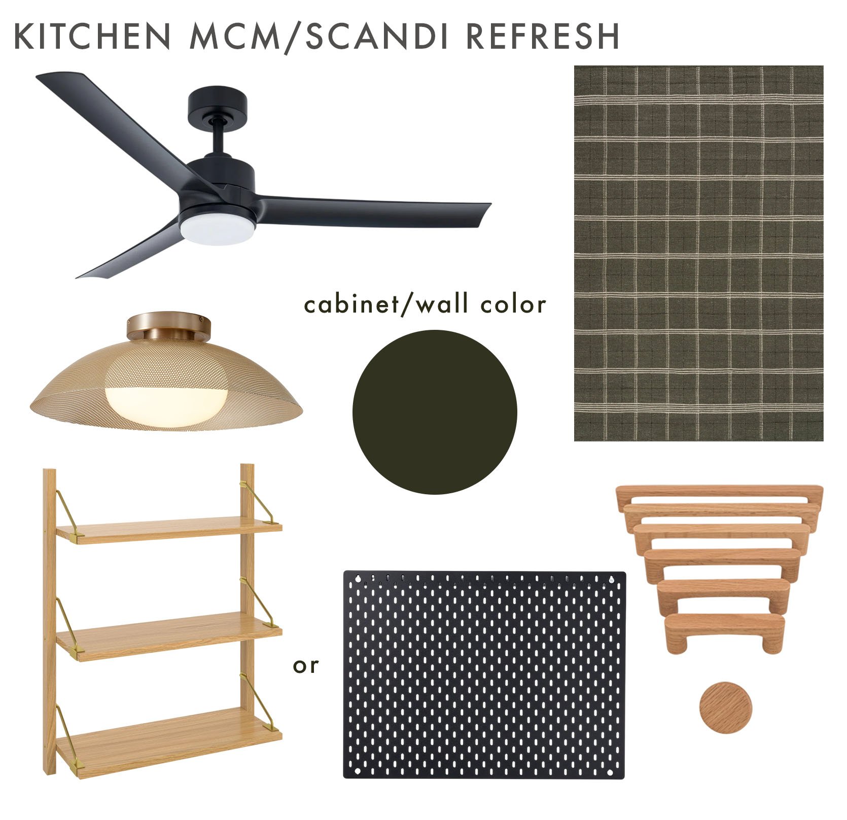
Ceiling Fan | Flushmount | Rug | Wall Shelf | Pegboard | Light Oak Handles and Knobs
Here are my initial thoughts. I think that they should paint that whole cabinet wall and the cabinets a deep green (highly recommend using Samplize to see what green looks best in the room before buying any paint). It will make that wall look really cohesive, purposeful, and the black hinges will also not be so contrasting. Then updating the hardware will instantly make the room feel more elevated and designed (plus with light oak handles, very much give MCM/Scandi and echo the two projects of ours she mentioned:)) Updating the flushmount and ceiling fan will also really dial in the design, and I love adding in a little brass to brighten things up, too. As for the two “shelf” options that would go above the stove, I love the light oak and brass one because it ties in both the hardware and the flushmount, but depending on budget, that black pegboard is large, $30, and great for hanging pots, pans, etc. That rug also feels in the River House/Kaitlin’s Living Room world, goes, with the cabinets, nicely contrasts the tiles in style and pattern scale, and it’s only $119 for a 4×6. So many wins! Everything here should add up to under $900 (as long as they don’t have to hire out for labor), meaning they have a few hundred more dollars for accessories:)
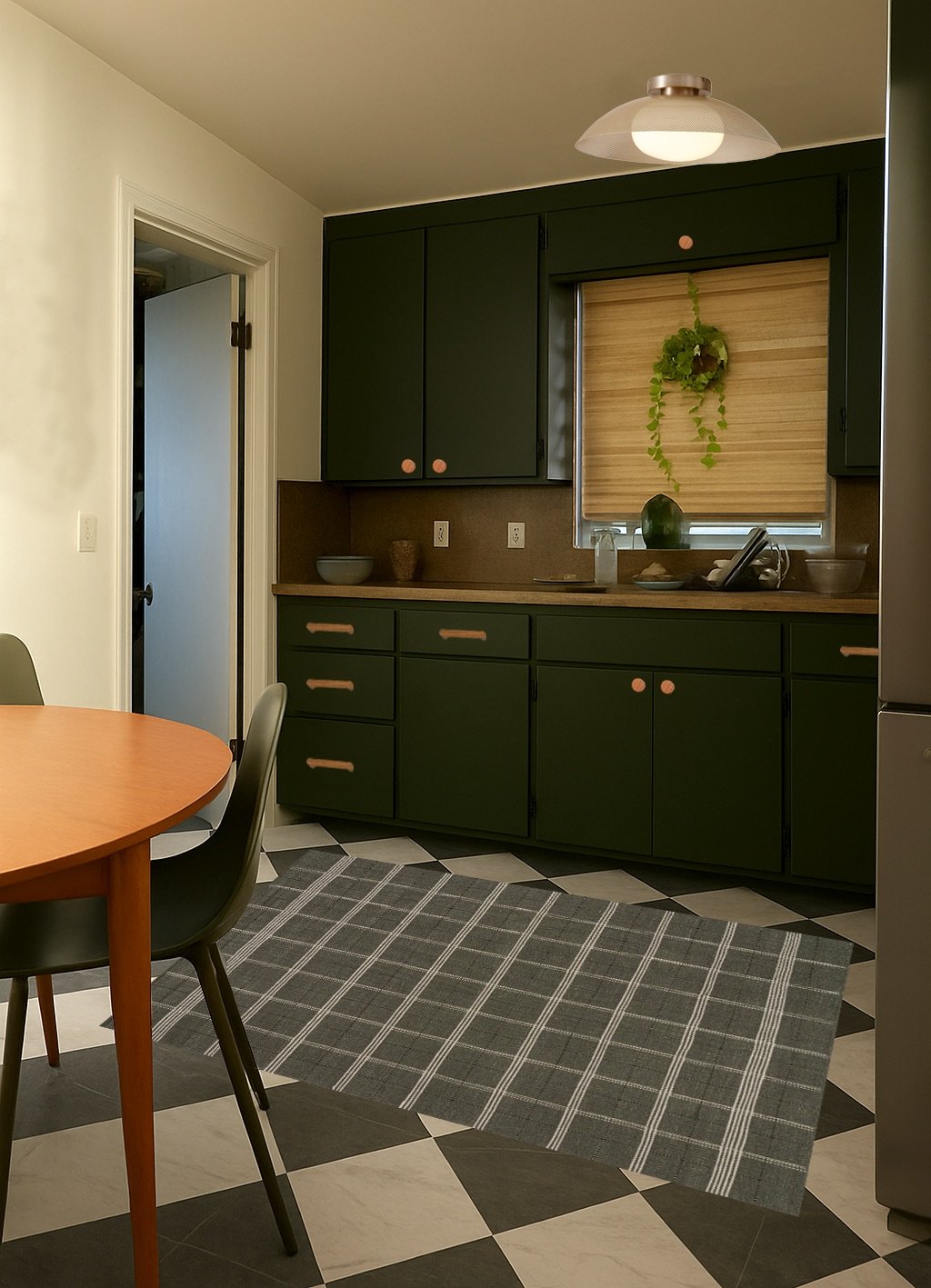
Here’s a part AI, part Photoshop mockup to show the impact of making those few updates! Not too bad, right?! Actually, really pretty:) In terms of the other walls’ colors, I think they should either go all white or all the warm tan they used. Simplifying will really help with overall cohesion. But what’s a kitchen without great accessories??
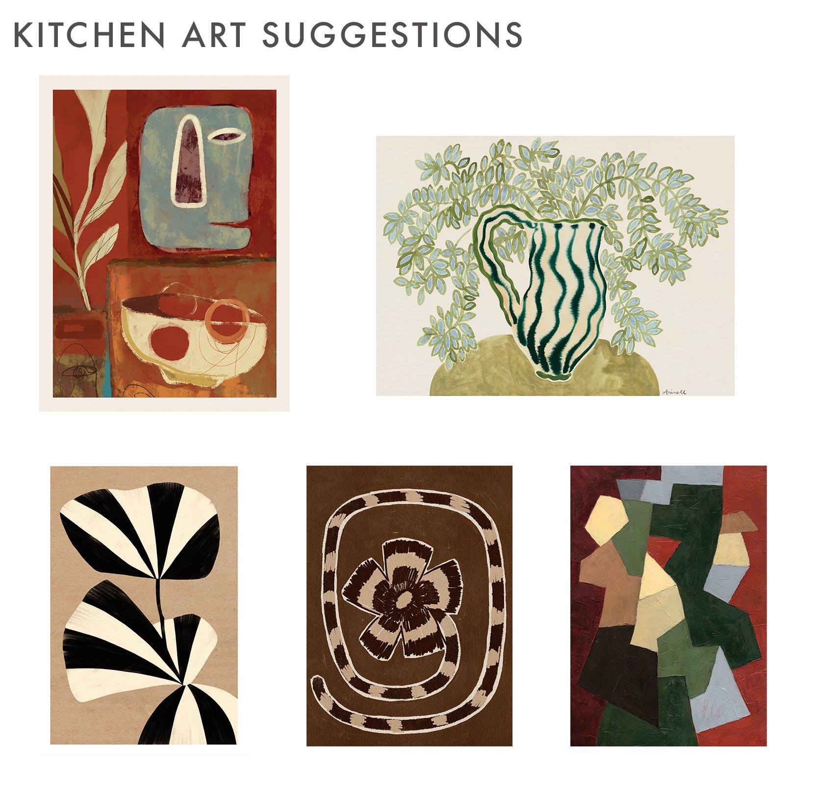
ART: (Starting Top Left Clockwise) Abstract Objects Print | La Poire – Wisterias Print | Sylvia Takken – In Bloom 2.0 Print | Shatha Al Dafai – Delicate Bloom 10 Print | In the Market Print
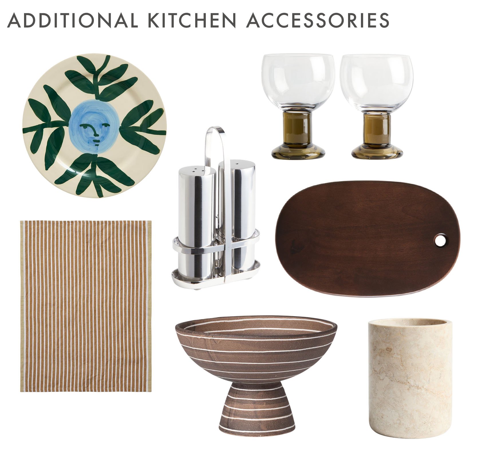
ACCESSORIES: (Starting Top Left Clockwise) Moon Face Vine Dinner Plate | Hand-Blown Wine Goblet (Set of 2) | Stainless Steel Salt and Pepper Shakers | Large Wooden Serving Board | Hale Tea Towel | Striped Footed Bowl | Marble Utensil Holder
I went for mostly really affordable options, but if they got all of these items (plus frames for the art), they would likely go over budget. So these can also be more inspo/a long-term plan for when they are shopping or even thrifting! Let’s start with the art. This color palette is rich and warm, and ties in all of the colors they would have in their kitchen. I based the style mostly on Kaitlin’s art in her living room, and all of it is from Desenio because their art is really pretty and so affordable. I would vary the sizing and go big! Large art looks really intentional and awesome. In terms of accessories, I kept things in the same color palette, made their there was a good mix of different materials and cool shapes.
The only other addition/swap I might make if the budget and measurements allowed would be to add something like this 5-tier shelving unit in place of the yellow bar cart. There’s nothing wrong with the cart, but the height and scale might look more intentional and also add more space for styling and storage space, especially with cute baskets. Just an idea:)
A Half-Designed Dining Room
Oh man, can I relate to a half-designed space and the stress that can bring. I’m here and happy to help!
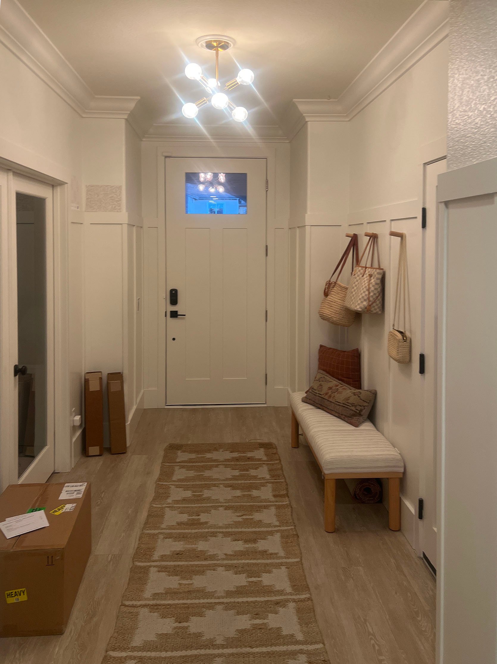
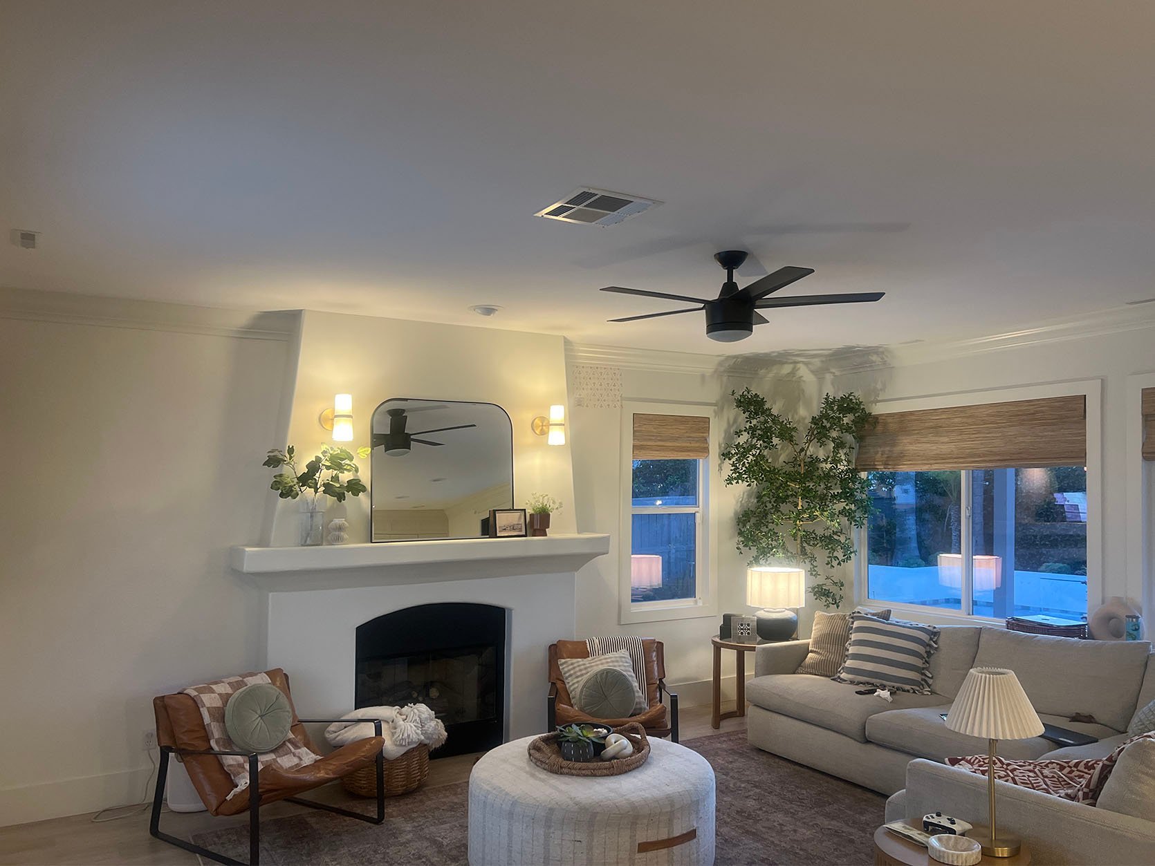
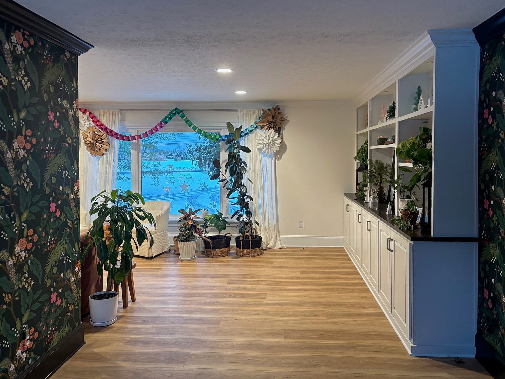
“Basically, my dining room is half-designed, but looking to round out the rest. I’ve been looking for a sideboard to complement our IKEA Morbylanga dining table and fill out this left empty wall. Looking to up the design ante a bit (i.e., I don’t want MORE IKEA stuff). The room faces east with a fantastic hillside view but has weak overhead lighting, so envisioning a sideboard/lamp situation (?) and guessing we need a rug to anchor the space. Especially since there’s a lot of wood going on. We host 20ish people for dinner here regularly (we just add more tables to the end lengthwise), so a sideboard space to put down drinks, etc, would be nice, but also don’t want it to get too tight—so flexible and not-bulky is ideal.
Design style/aesthetic: Welcoming and inviting, modern/MCM, clean, fresh, comfortable (adjacent living room photo attached for reference)
Budget: Not huge! Would love to keep everything under $1500 if possible. We also have kids and host kids, so nothing too precious. Not looking for heirlooms :).”
Ok, now that we know the needs, here are my suggestions!
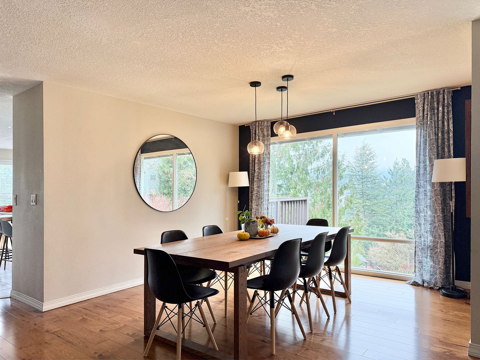
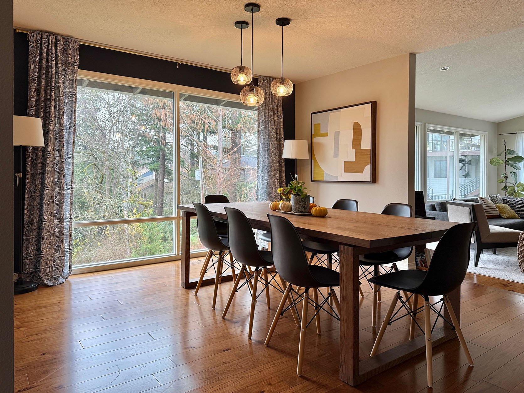
First off, I’m curious what the space would look like with the other two walls painted the blue color. Doing that might make it feel more like its own unique room? I’d love to hear your thoughts in the comments:) Second, I’d suggest having the curtains hemmed so that they “kiss” the floor instead of puddling. That look can totally work, but I feel with a more modern design, that tailored hem makes a bit more sense. There’s always the option to use hemming tape if she doesn’t want to pay to get them hemmed. My last suggestion before I get into the products I chose is to only use one of the floor lamps instead of two. Symmetry is, of course, great, but I think sticking with the one in the corner by the art is going to feel better once a sideboard and accessories are on the other wall.
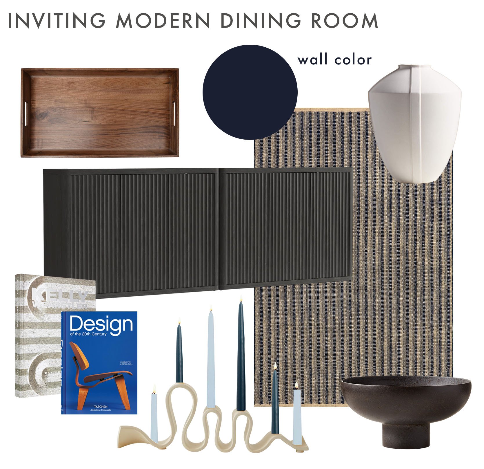
Solid Wood Tray | Sideboard (Set of 2) | Ancien Cream Vase | Rug | Kelly Wearstler: Synchronicity Book | Design of the 20th Century Book | Dark Blue Taper Candles | Light Blue Taper Candles | Weylyn Candelabra | Black Ceramic Pedestal Bowl
Here’s what I came up with. First off, I chose a really affordable rug (from our old line) so that with all the kids and company over, the host wouldn’t be too freaked out by any messes. It’s also got a great stripe pattern which nicely contrasts with the more organic pattern on the curtains. Then I know a sideboard was the main request, so I found this sideboard set for under $600 that’s over 90″ long! It was important to me to have a solid base (aka no legs) since the table and chairs have so many. Visual balance:) I also chose black wood to complement the chairs, but contrast the wood color and fluted detailing to work with the rug’s stripes. If it’s not clear, it was a very intentional choice:) To decorate the top of the sideboard, I chose that big wood tray (again, for wood contrast) and that modern white vase with some delicate detailing. I also really wanted a cool candelabra, which is likely the most “precious” item, but with some museum putty, I’m sure it would be safe. To then make sure it all wasn’t too colorless, I added those light and dark blue taper candles. It’s an easy and affordable way to add color and playfulness! Naturally, I had to include some modern design books of varying sizes to stack, and then finally a simple but beautiful black footed bowl for the table. Nothing too crazy, but will make an awesome difference, and I believe I’m under budget:)
Home Finishing Touches
This one was pretty fun to play with, but let me let the reader explain first:
“Our style is a mix, I guess. I love organic, color, old, and new mixed together. I do have a 10-year-old girl who loves to flip all around the house, and an 8-year-old son who plays with Legos a lot and builds things. So soft, comfortable, and easy to clean, a must.
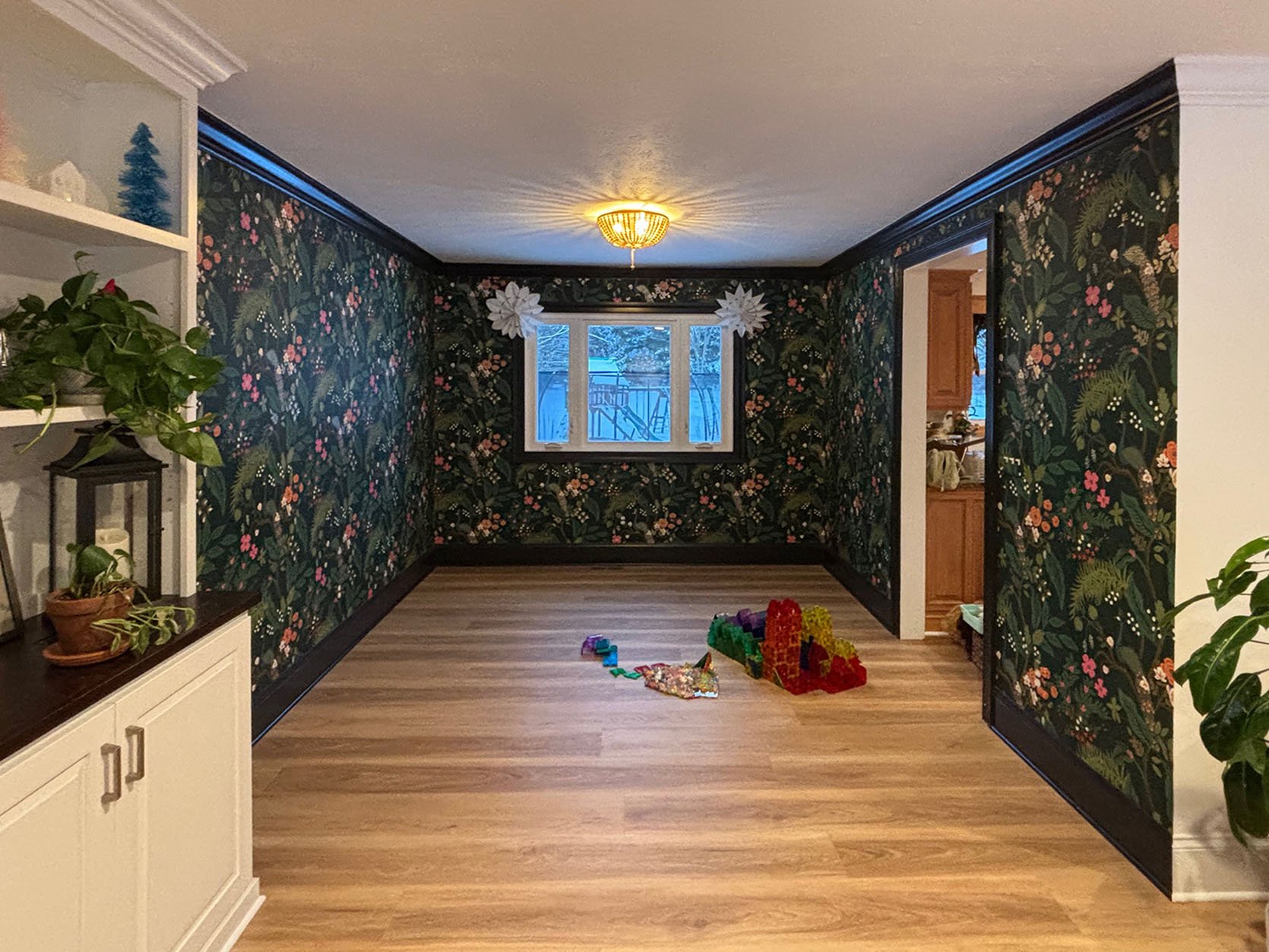
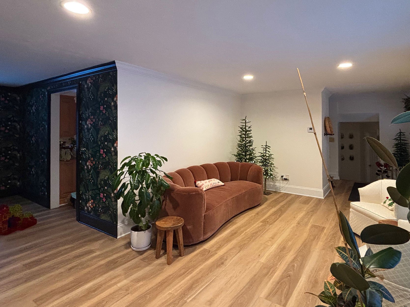
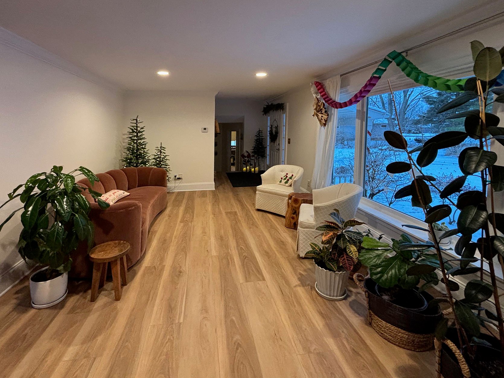
The couch is new from the Arhaus outlet. It is the Amira sofa, color cinnamon fabric, velvet, and is 90”. The chairs are from my grandmother and are currently as you see in silk washable fabric. Willing to switch out. The main walls are all Swiss Coffee by Benjamin Moore at 25% lighter. FYI, we will be painting kitchen cupboards, just haven’t confirmed yet. But leaning towards a blue color (similar to the blue in the peacock in the wallpaper) to go with the wallpaper. We love color. In the dining room, we have the Emerald peacock Rifle Paper Co. wallpaper, and the trim is Tricorn Black by Sherwin-Williams. I would love to bring dining room colors into the living room somehow. Maybe have a light, rug, curtains entry table for more storage for kids’ gloves. Idk. Whatever you think. And no, we haven’t gotten a table for the dining room yet. Waiting for Arhaus Perry to come to the outlet store in brown. But if I find something else, I would purchase. The budget for each room would be no more than $5k for each.”
See? Exciting! Here are my initial thoughts. I agree that more of the dining room colors need to come into the living area for balance. I am also pro pulling the blue from the wallpaper and painting the built-in in that. That will look so great. Then, full transparency, I’m a little over budget (more so with the living room, but there are ways to get closer to her goal!) Let’s start with the living space.
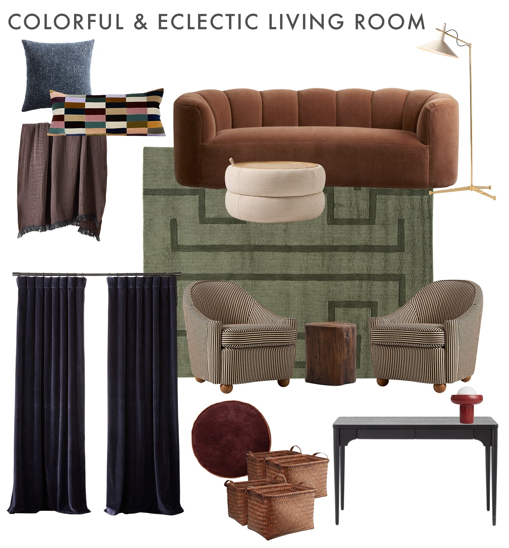
Blue Pillow | Holly Cushion Cover | Wool Two-Tone Throw | Sofa | Floor Lamp | Storage Ottoman | Rug | Curtains | Accent Chair | Stump Side Table | Burgundy Pillow | Woven Baskets (Set of 4) | Entryway Console Bar | Red Table Lamp
I put in the sofa to really get a full picture in the mood board. Let’s talk rug first. I love green and how much richness (but not too much) it adds. It’s washable and from a company that both me and my cousin with a dog and a baby swear by. I’m also thinking those lines could act as race tracks for little cars?? The ottoman has storage, the top can flip to be cushioned or flat for playing, and is made in a performance fabric. Plus, I love how the lighter sand colored fabric breaks up the color of the sofa and the rug and complements the lighter stripes in the accent chairs. Now, I really like the accent chairs she has, but the white fabric is a little stark compared to all of those warm and rich colors. Plus, I love the idea of a pattern! However, these aren’t cheap, and they aren’t performance. It was my one “form over function” decision, but maybe they would be totally ok!? They are just sooooo good. The stump side table was to add to what she already has in the room. Before we move to textiles, I am just so in love with that floor lamp. It’s a Paul McCobb, and since she said she also likes old things, this kinda falls in that category. And with so many curves, it’s nice to have a really angular piece in the room.
Textiles? I like the idea of having a pillow a similar color to what the built-in is going to be to tie it in. But she also mentioned they love color and that checkered lumbar is an Emily/EHD favorite and really speaks to the total color palette. I then didn’t want to get too color crazy, so I chose a quieter, but still rich, throw blanket. For the chairs, I don’t think she could go wrong with those round burgundy pillows. The curtains, I think, need to be dark for visual balance, and since the velvet is on the other side of the room, why not more? These navy velvet ones are so perfect. In a dream world, she would buy four (two on each side) so they feel full and maybe even custom, but they also aren’t cheap.
Her last request was an entry table, but I’m not sure I got measurements for that, so I took a guess and really loved this table. It’s simple with elegant details, with a drawer and space underneath for the necessary storage baskets. And why not finish it off with a fun, modern red lamp!? Let me show you the dining room, and then you can give me all of your thoughts:)
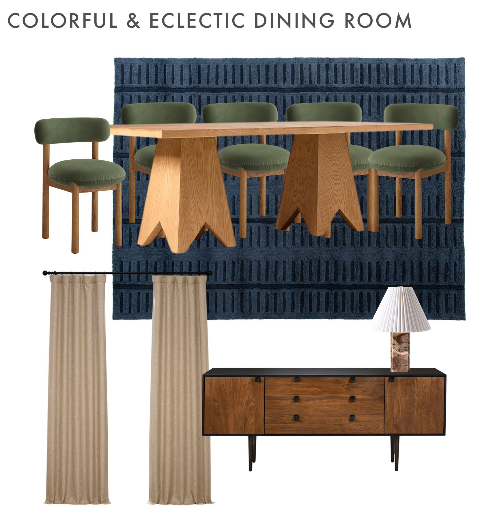
Dining Chairs | Dining Table | Rug | Curtains | Sideboard | Table Lamp
TADA! Another beautiful washable rug that my cousin owns and uses under her dining table, so I feel even more confident recommending it. Then, to keep the color as a priority, I chose those velvet green dining chairs. Maybe controversial, but velvet isn’t too bad to clean, and they are stunning. I couldn’t seem to find the Arhaus dining table she was talking about, so I chose yet another Pierce & Ward piece from their West Elm collab. Not sure if this table will be their taste, but I love it (clearly, ha). It just looks so interesting and special. Then, since that nook is fairly dark with the wallpaper, I like the idea of doing a tan curtain in a linen to offset the velvet, too. These are the same curtains Caitlin used in her living room, and she still raves about the quality and insanely affordable price. Finally, I felt like a sideboard was a good idea, and this one is perfect. The undertones of the wood doors to the dining table seem to be the same, and I love the black outside and how it complements the wallpaper. The final piece is that marble lamp, because why not?! It’s cool, a little unexpected, and functional. I really like these two room ideas a lot and hope the reader does too!!
So now let’s hear your thoughts! Any feelings? Suggestions? Let’s chat! And thank you to everyone who submitted, and hopefully to those of you who were chosen, I truly hope this was helpful<3
Love you, mean it.
Opening Image Credits: Design by Emily Henderson and Sarah Weldon | Styled by Emily Henderson and Emily Bowser | Photo by Steven Mcdonald | From: The Prettiest Green And Pink Kitchen Remodel That We Completed In 7 WEEKS