It can be hard to believe that we’re already taking a peek at 2026 predictions, yet here we are. The paint companies have gotten it started with their picks for the paint colors of the year. This year’s lineup features gem tones, warm neutrals, a classic ivory, and so much more.
While the paint colors of the year are from all parts of the color wheel, there does seem to be a throughline—almost all of the colors are described as relaxing, grounding, and elegant. In an ever-changing world, the trending paint colors are ones that make our homes feel safe, comforting, and inviting.
Take a look at the paint colors of 2026 below.
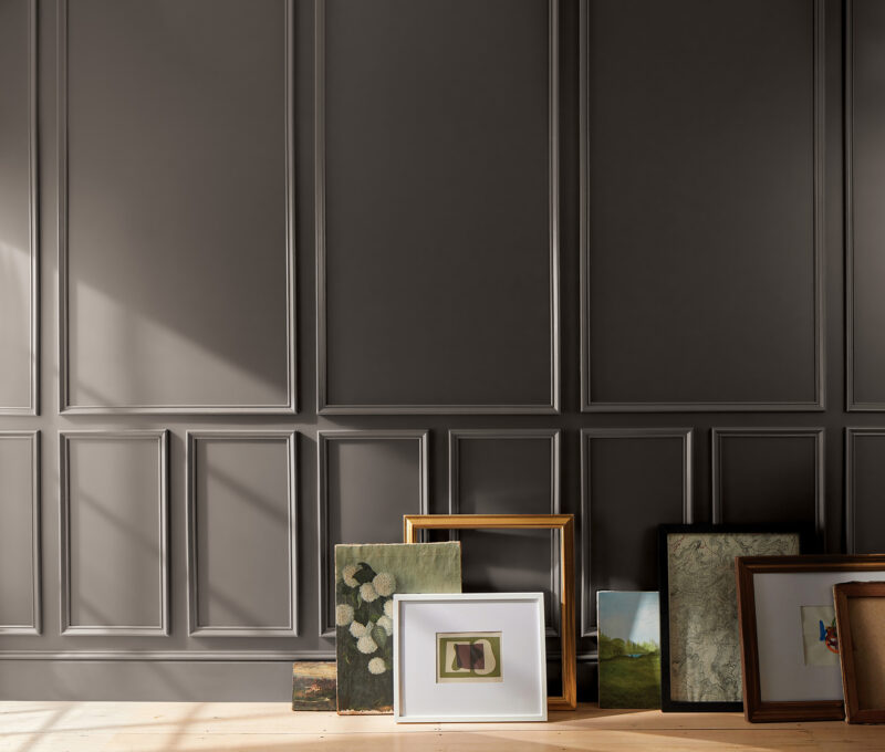
Silhouette AF-655 by Benjamin Moore
A rich espresso with hints of charcoal, Silhouette is Benjamin Moore’s 2026 Color of the Year. The choice was based on fashion, as the hue is inspired by a modern take on classic suiting.
“The connection between fashion and interiors has always been a source of inspiration but this year in particular, we’ve noticed a renewed interest in suiting and classic silhouettes; the resurgence of timeless pieces; and the growing interest in the brown color family,” said Andrea Magno, director, color marketing & design at Benjamin Moore. “Silhouette embodies these qualities with its depth and luxurious blend of burnt umber and delicate charcoal undertones. Like a perfectly tailored suit, this hue has the versatility and softness to bring a space from expected to exceptional.”
Hazelnut Crunch 09A-5 by Clark+Kensington
Aside from the fact that its name sounds tasty, Hazelnut Crunch is a deliciously rich, earthy, and warm brown that will create a cozy feel in any space. The shade choice was inspired by the trends of biophilic design, cozy minimalism, and nature-rooted tones.
“In an increasingly fast-paced world, homeowners desires paces that offer restoration, comfort, and calm,” said Kim Lefko, Chief Marketing Officer at Ace Hardware. “Hazelnut Crunch delivers all of that and more. It’s a beautiful, deep shade that creates the perfect backdrop for relaxed living, pairing effortlessly with both natural textures and modern elements.”

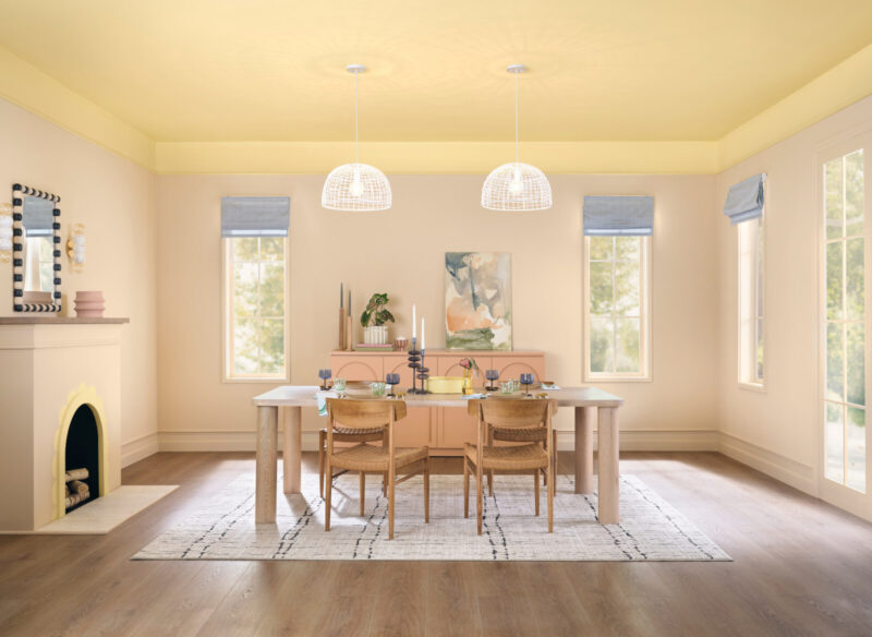
C2 Paint Epernay #639
If you love the elegance of European design, C2 Epernay #639 is for you. It’s named after a French village that’s known for rolling vineyards and limestone architecture, and takes inspiration from the pale yellows that were found in European interiors during the Beaux-Arts and Neoclassical periods.
“C2 Epernay has long been tied to European influences and is now emerging in contemporary design for its classic, versatile ambiance,” says Philippa Radon, interior designer and C2 Color Specialist. “This historic hue helps us retell the wondrous stories woven through history via the inseparable threads of color, art, furnishings, and nature. It reminds us to appreciate the personal touches that make a home uniquely ours—and to live with reverence for the stories we’re creating every day.”
Melodious Ivory 313-2DB by Dutch Boy Paints
Dutch Boy Paints went with a soft and creamy beige as their 2026 pick, which the company says speaks to a cultural shift towards simplicity, authenticity, and intentional living.
“Our 2026 Color of the Year invites homeowners to embrace what matters most—comfort, quality, and connection,” said Lisbeth Parada, Color Marketing Manager, Dutch Boy Paints. “Melodious Ivory offers a classic backdrop that beautifully supports the textures, elements, and personal touches that make a space truly feel like home.”
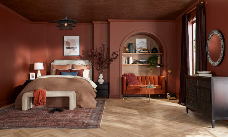
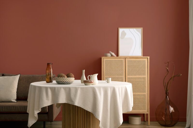
Warm Mahogany PPG1060-7 by Glidden
Described as “rich, warm-toned, and timeless red,” Warm Mahogany is Glidden’s 2026 Color the Year. The paint company sees it as a color choice for anti-trend seekers—they see it as both quiet and loud, and traditional and modern.
“We’re torn between colors that feel authentic, personal and safe, and those that give a rush of newness, risk, and excitement. Converging style and history, Warm Mahogany is a perfect match with the Glidden brand’s 150-year heritage—bold enough to draw immediate attention and reserved enough to make a timeless statement. This color truly outlasts the moment and owns the mood!” says Ashley McCollum, Glidden paint color expert.
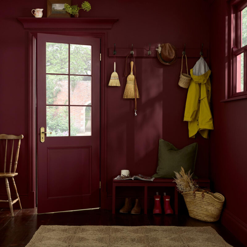
Divine Damson by Graham & Brown
Graham & Brown went with a moody, deep plum, Divine Damson, for its 2026 Color of the Year. The brand called it “a timeless and versatile color that suits a variety of styles and environments. The dark damson color evokes a sense of elegance, luxury, and sophistication.”

Matte Coffee Bean by Krylon
Matte Coffee Bean was chosen for its classic, elevated feeling, and its tranquil qualities. Krylon hopes that the color encourages consumers to focus on what matters and to refresh the pieces they already own and craft with longevity in mind.
“Matte Coffee Bean adds dimension with a natural, grounded allure, aligning with today’s increasing appeal of organic minimalism,” said Lisbeth Parada, Krylon Color Marketing Manager. “Inspired by elements like clay, wood, and stone, this hue is a timeless yet sophisticated choice that elevates everyday spaces and invites a sense of harmony and serenity into the home.”

Universal Khaki by Sherwin-Williams and HGTV Home by Sherwin-Williams
A grounded and timeless neutral, Universal Khaki is a versatile and understated way to upgrade your space.
“Khaki is more than just a neutral—it’s a timeless, go-anywhere shade that brings a sense of grounded elegance to any space,” shares Sue Wadden, director of color marketing at Sherwin-Williams. “With its warm, earthy undertones, Universal Khaki SW 6150 effortlessly complements a wide range of colors, creating a rich, inviting backdrop that can transform an entire design with quiet confidence.”

Warm Eucalyptus (8004-28F) by Valspar
If you want to feel instantly relaxed, you can just look at a paint swatch of Warm Eucalyptus, Valspar’s 2026 pick. Like many of the other paint companies, Valspar chose the hue to reflect consumers’ desire for calmness in their homes.
“Warm Eucalyptus is more than just a beautiful shade of green, it’s a reflection of the comfort we crave in our homes,” said Sue Kim, director of color marketing at Valspar. “Its warm undertones create a grounded, welcoming mood while drawing inspiration from nature and the familiarity of retro design. This is a color that encourages restoration and resilience.”