If you don’t know your eggshell from your semigloss, read this before you pick up a paintbrush.
Welcome to Color Stories, a series where we look at how (and when) to be brave and bold with color—and look at the trends that shape the colors we use and why.
Years ago, during my first attempt at interior painting, I set out to create an accent wall in my home office. I recall wanting a shade that would spark creativity while evoking a sense of relaxation. So naturally, I went with a burnt orange (read: sarcasm). I liked the color well enough, but in hindsight, the paint job fell way short of my expectations. The shade didn’t exactly produce zen vibes, but it was the bland appearance of the result that was the most bothersome.
When I picked out the paint for my dreadful accent wall, I mainly obsessed over the color, squinting through closed eyes trying to imagine how the finished product would look. It would’ve helped if I took time to carefully take into account the differences between paint finishes before making my choice.
In an effort to help any other anxious painters from skipping this crucial step, we tapped interior designer Anu Jain of Atelier Oleana along with Farrow & Ball Brand Ambassador Patrick O’Donnell and managing director Gareth Hayfield to highlight the differences between paint finishes, when and where to apply them (or not) and why.
The easiest way to tell one finish from another
A quick side-by-side paint finish comparison will reveal differences in appearances—but that’s just the start. “You’ve got the aesthetic look but there’s also different levels of durability,” Hayfield explains. “The difference is the amount of light being reflected back off that paint surface. For instance, 100 percent of the light that hits a mirror comes back off. With full gloss, it’s got 95 percent reflection so 95 percent of the light hitting it gets reflected.”
Go flat or go matte

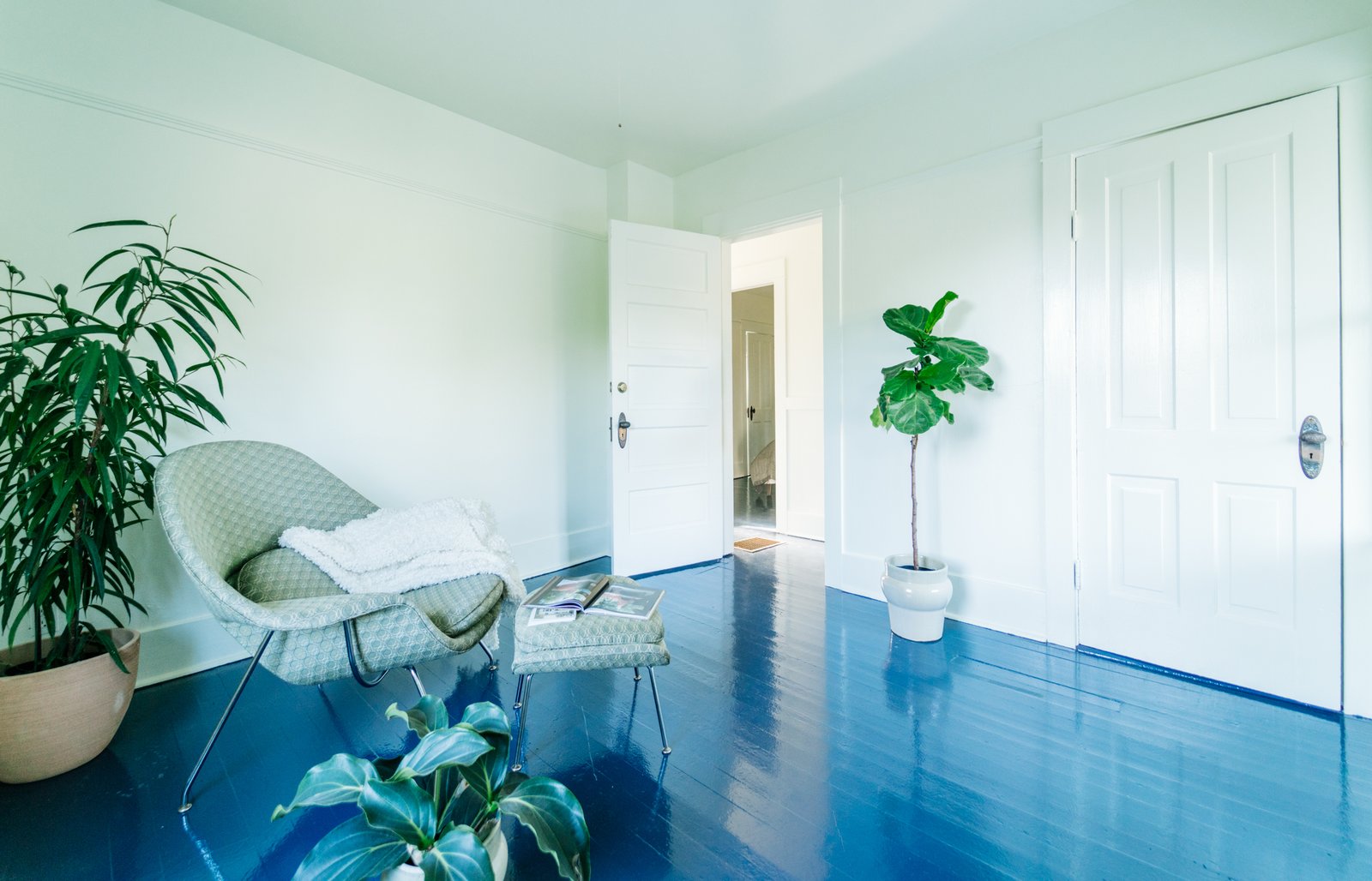
The walls match the floors in tone, but not necessarily in sheen—the floor is finished in Benjamin Moore Floor & Patio paint in Balsam 567, as well as three coats of Minwax polyurethane.
Melissa Dalton
For an understated look with a soft, non-shiny finish, choose flat or matte. Either choice is optimal for low-traffic areas and concealing tiny dents but Hayfield says to bear in mind that matte finishes are more difficult to clean and more prone to damage.
“In a classic sense, the higher the sheen level was, the more durable a paint was but more recently over the years, that durability has been extended down into more and more matte paints,” Hayfield adds. “With the launch of our dead flat paint finish—which has a very low sheen level at two percent —you can paint things like baseboards and doors where you wouldn’t have been able to do that previously.”
Eggshell
Take matte and add some sheen and you’ll have eggshell. You can generally remove stains and scuffs with a damp cloth, making this subtle finish slightly easier to maintain than its less flashy counterpart—just enough to bounce a little light and give your walls, hallways, living room, or office spaces a soft glow.
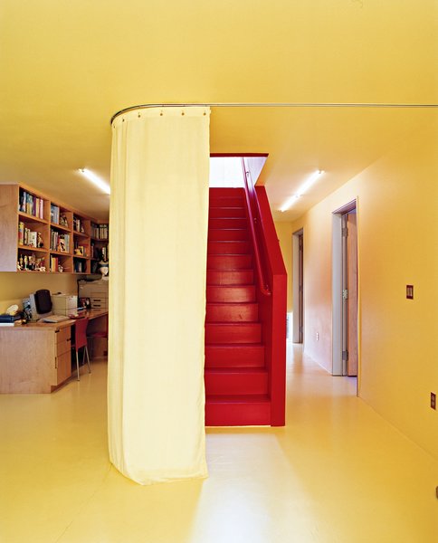
High-traffic areas like stairs, as seen in this striking red, will work best with a little bit of gloss for durability and impact.
Photo: John Clark
“I wouldn’t generally recommend eggshell for use or wood and concrete floors or kitchen cabinets but with a flat eggshell (launching in September) we’re able to provide slight nuances in terms of performance,” Hayfield says.
Satin
Smooth with a touch of gloss, satin is another easy-to-clean finish that adds a slight glimmer to your space. Add a coat to high-traffic areas like the kids’ room and common spaces like the kitchen where spills and stains can be removed with minimal effort.
Semigloss
On the shinier end of the spectrum, semigloss works best for bathrooms, cabinets, doors or any other surface subject to stains and moisture. But beware: all those surface flaws will be extremely visible. For instance, if you’re painting, semigloss will make dents, uneven textures, bumps, marks, or brush marks to show clearly.
Gloss and High-Gloss
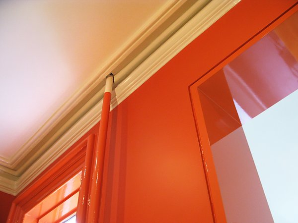
In this Brooklyn townhome, the walls are flat and the trim, super high-gloss in the same color—an easy way to make a space feel dimensional.
Photo: Sara Dierck
See the full story on Dwell.com: What’s the Actual Difference Between Paint Finishes?
Related stories: