There’s a reason your beautiful portfolio site isn’t bringing in the right clients – or enough of them. It’s not because your work lacks impact, personality, or polish. It’s because portfolio websites are designed to show work, not sell it.
Let’s talk about what’s missing from most portfolio sites, why it matters more than you think, and how to turn your site into a clear, confident client pathway.
When Design Alone Isn’t Enough
Most designers, architects, and creatives pour energy into making sure their website is aesthetically perfect. But when the site behaves like a gallery – all show, no direction – it leaves visitors unsure of what to do next.
A portfolio site tends to:
- Prioritize visuals over messaging
- Leave the value proposition unclear
- Offer limited calls to action (if any)
- Lack structure around the buyer journey
- Skip over what it’s actually like to work with you
I’ve seen this happen repeatedly. A designer has a gorgeous site, gets compliments on it, and still… the leads are dry or unqualified. It’s frustrating, especially when you know your work speaks for itself – but clients don’t buy based on visuals alone. They buy when they feel understood and confident that you’re the right guide.
Your Website Should Do More Than Showcase
If someone lands on your site, they’ve already seen something – a pin, a referral, a social post – that made them curious. Your website’s job isn’t to impress them visually but to move them from curiosity to clarity and guide them toward action.
That’s why portfolio websites fall short. They stop at admiration. What you need instead is a strategic pathway.
From Lookbook to Lead Generator
A website should walk your visitors through a process:
- Who you are
- Where you are offering your services
- What you do
- Who you help
- What working with you is like including expected investment
- What to do next
Think of it like a conversation. A portfolio-only site is like someone walking into your showroom and no one says hello, offers context, or shows them around. A conversion-driven site, on the other hand, warmly welcomes them, shows them around, and invites them to take the next step – on their terms.
Let me show you what that looks like in practice.
What to Do Instead
Start with your message – not your gallery
Your homepage should answer four key questions immediately:
- What do you do?
- Who do you do it for?
- Where do you work?
- Why does it matter?
This isn’t the place for clever taglines or vague branding statements. Say it simply and clearly – the kind of language your best-fit clients would actually use.
Design for the journey, not just the scroll
Every page should lead to something. Visitors are at different stages of readiness. Some just want to know more, others are close to booking. Offer actions that meet them where they are.
- “Learn more about our process”
- “View recent projects”
- “Start your project”
CTAs like “Book Now” can feel like too much too soon. Layer softer steps that help build confidence, and also friction since you likely don’t want everyone to book a call without knowing more about your processes.
Layer your content for different attention spans
Not everyone is ready to dive into case studies right away. Structure your pages to cater to scanners and deep divers.
Example page flows:
Homepage → Services Overview → Signature Process → Contact
Featured Project → Project Story → Behind-the-Scenes → Inquiry Form
Use real, conversational language
Avoid phrases like “bespoke solutions” or “tailored interiors that reflect your lifestyle.” What does that actually mean to someone? Try:
“We help growing families design homes they love coming home to – with layouts that actually work for your real life.”
If your clients wouldn’t say it, don’t write it. Speak directly and simply. That’s what builds trust.
Read: How To Design Your Signature Message
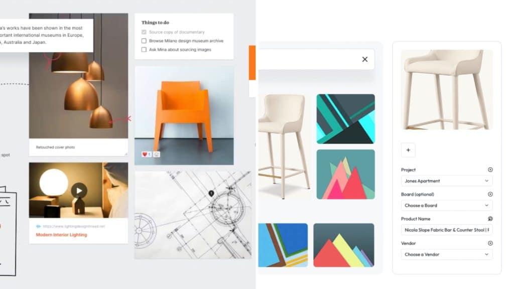
Let your work tell a story – not just a visual one
Images are essential. But they need context.
- What was the client’s goal?
- What challenges did the space present?
- What was your approach?
- How did it change their life or business?
Adding 2–3 short sentences under each image makes a huge difference. One of our clients started adding these “micro-case-stories” and noticed visitors stayed on her project pages 3x longer.
When Your Website Works, Everything Feels Easier
A website built for connection and conversion changes the way your business runs. You spend less time explaining things. Your inquiries come from people who “get it.” Your brand feels clear and aligned from the first click.
 2")
Best of all? You stop relying on social or referrals alone. Your site becomes the silent salesperson working in the background – 24/7 – guiding visitors toward your services with ease.
If You’re Still Stuck in Portfolio Mode…
You’re not alone. Most designers start there. It feels natural to show your work first. But your future clients need more than inspiration – they need clarity and confidence.
Here’s what to ask yourself:
- What does my homepage assume people already know?
- Where are visitors left hanging?
- What soft CTAs could I add to guide interest into inquiry?
We’ve helped hundreds of creatives shift from “pretty but passive” to websites that actually grow their business. You don’t need to add pressure or sales tactics – just structure, clarity, and strategy. If your site is ready for that shift, now’s the time.